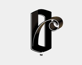
now why would I go and do a thing like that? That woul be foolish with the exposure of Eulda. I even won a Wolda myself ...but I havent seen that logo, and I dont know if Moor in finish does mean More. Anyone? My intention with the logo and the previous was to vary the space of the o, fitting it with different sentences related to consumation. I guess I have to reconsider this though. Just need to find out what moor actually means first
I agree with onward design. Now I would not have been so accusatory with it. But the beauty of this open and broad format here. Is you get a good sampling of various sets of eyes and experiences. I post here mainly to see if my concept has been done before and to get crits. **For me, I instantly recognized the logo from another source. So I would not use it (and this has happened to me here as well). Although yours is a nice implementation. It is just too close to the other concept IMO. Again not saying it was a direct rip....great minds tend to think alike
@KGB. Thanks for your valuable input.**@ ddd. First off. I really havent seen that logo before. And for your FYI. That logo you reffer doesnt have anything do do with More. It doesnt mean anything. The concept is based on space and adaptable furniture in space (I think) In that sence I have a TOTALY different concept. I play on the pronunciation ...the O will vary depending on how much mooooooooooooooooore you aim for. So great minds think alike, but not in this case. But I think its nice to have a discussion around this topic.* *@morelucas. Great minds think alike%3B)*@mouvedia. Glad I made you smile:)
Hey AD**I have no doubt you haven't seen the design. It happens to us all. But like I said my opinion is I would dump it. It's just too close. But do what you do. I still like your implementation tho. **Farmill - I like that a lot as well.
The stripes don't take anything away in my opinion. And I agree with Action Designer that this is a simple case of great minds thinking alike, but in two completely different ways and industries. There really isn't much conflict here. Certainly I have pulled some logos I've posted when pointed out they look very similar to another, but I've kept some as well for the same reasons I say here. No, in this case I'm with Action Designer. Sorry DDD. Floated.
I'm chasing up a query about an alleged copy of this logo on 99designs. I would really like to hear about it if you guys have some other examples that are potentially infringing. We certainly don't tolerate copying on 99designs, but I am always very careful to hear all sides of the story first and do some background research. It's always possible for the same idea to evolve independantly in multiple places, assuming people are guilty might be convenient, but it sucks when you are on the receiving end. Help me do the right thing here and let me know if you have any further details that might help.**Lachlan Donald, 99designs.com (lachlan@99designs.com)**

Lets Discuss
Love it!
ReplyMuch appreciated:)
ReplyThis is better
Reply1 - this one is way better. Not sure about the hatch fill though.
ReplyThanks a lot for you feedback:)
Replyclever!...
ReplyThanks nido:)
ReplyCoincidence?**http://www.eulda.com/images/win07/Finland_150.jpg*
Replynow why would I go and do a thing like that? That woul be foolish with the exposure of Eulda. I even won a Wolda myself ...but I havent seen that logo, and I dont know if Moor in finish does mean More. Anyone? My intention with the logo and the previous was to vary the space of the o, fitting it with different sentences related to consumation. I guess I have to reconsider this though. Just need to find out what moor actually means first
Reply%5E I concur, and yours is better IMO.
Replythis one is %22more%22 in sync concept wise.
Replyi like this one much much more
ReplyAppreciate all the feedback:) thanks
Reply:)
ReplyThis is great, it looks just like a logo I was thinking about for my own name. Nice job :) cheers!
ReplyI agree with onward design. Now I would not have been so accusatory with it. But the beauty of this open and broad format here. Is you get a good sampling of various sets of eyes and experiences. I post here mainly to see if my concept has been done before and to get crits. **For me, I instantly recognized the logo from another source. So I would not use it (and this has happened to me here as well). Although yours is a nice implementation. It is just too close to the other concept IMO. Again not saying it was a direct rip....great minds tend to think alike
Replythe fill on the letterforms is distracting and doesn't add anything to the design.
Reply@KGB. Thanks for your valuable input.**@ ddd. First off. I really havent seen that logo before. And for your FYI. That logo you reffer doesnt have anything do do with More. It doesnt mean anything. The concept is based on space and adaptable furniture in space (I think) In that sence I have a TOTALY different concept. I play on the pronunciation ...the O will vary depending on how much mooooooooooooooooore you aim for. So great minds think alike, but not in this case. But I think its nice to have a discussion around this topic.* *@morelucas. Great minds think alike%3B)*@mouvedia. Glad I made you smile:)
Replyhttp://logopond.com/gallery/detail/39325 is a similar concept, personally I prefer that one.
ReplyHey AD**I have no doubt you haven't seen the design. It happens to us all. But like I said my opinion is I would dump it. It's just too close. But do what you do. I still like your implementation tho. **Farmill - I like that a lot as well.
Replynothing else!
Replylol Tonfue, some good points there*Good work man
Replyeither drop the lines or lighten its stroke. they detract a bit as they are now like KGB said.
ReplyThe diagonal lines are trendy. That look is part of a fad that is finally dying off. It would look better in a solid color.
ReplyThat's clever! I also like the stripes.*Well done!*
Replycool typo play..
Replythis is very cleaver
Replyi love it, ...
ReplyThe stripes don't take anything away in my opinion. And I agree with Action Designer that this is a simple case of great minds thinking alike, but in two completely different ways and industries. There really isn't much conflict here. Certainly I have pulled some logos I've posted when pointed out they look very similar to another, but I've kept some as well for the same reasons I say here. No, in this case I'm with Action Designer. Sorry DDD. Floated.
Replyvery good!!!
Replyhttp://99designs.com/contests/14691 **Seems like everyone likes your work
ReplyI'm chasing up a query about an alleged copy of this logo on 99designs. I would really like to hear about it if you guys have some other examples that are potentially infringing. We certainly don't tolerate copying on 99designs, but I am always very careful to hear all sides of the story first and do some background research. It's always possible for the same idea to evolve independantly in multiple places, assuming people are guilty might be convenient, but it sucks when you are on the receiving end. Help me do the right thing here and let me know if you have any further details that might help.**Lachlan Donald, 99designs.com (lachlan@99designs.com)**
ReplyFor blatant rip-offs we ban, and for minor infractions we give a fairly lengthy suspension.
ReplyIf your business is holding logo contests for %24150, just assume a majority of it is ripped off...either conceptually or literally.
Replyor better still.. why have a site that degrades the business all together?
Replybecause there's a demand for its services
ReplyAnother of yours I very much enjoy. Thanks for posting. (Yep, I'm a little late :)
ReplyI reading — moore.
ReplyI was wondering if this is also a play on the word %22moire%22 because of the fill pattern you put in.
Replywonderful!
ReplyHi there. Trying to contact you but seems really difficult.
ReplyAny contact details. I have already send you a message through Behance
Please login/signup to make a comment, registration is easy