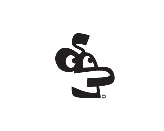
Mangia Mangia - Pasta Bar
by Raja • Uploaded: Oct. 14 '08

Float
(Floaters:
9 )
Description:
ID in process for new age eco friendly pasta bar / restaraunt
As seen on:
www.rajasandhu.com
Status:
Nothing set
Viewed:
8158
Share:


Lets Discuss
I got inspired after seeing this on my desk**!image link!:http://rajasandhu.com/images/noodle.jpg
Replyhttp://rajasandhu.com/images/noodle.jpg
ReplyI think the shape of your noodle needs to look more like the one that raja's holding up in the photo. Your shape is close, but the open end on the left side of the noodle just doesn't look right - I don't think it's necessary to show it. Just draw the noodle with the open end hidden (ie, facing down).**I would also take another look at the way in which you're handling the descender of the %22g%22. It looks like an afterthought.
ReplyI agree, GREAT concept you have going, just needs to be refined.
ReplyGREAT colors, GREAT concept, GREAT type... but needs some love.
ReplyYou must have had fun drawing this. Reminds me of a water flume at a theme park.
Replyoodles!
ReplyAwesome concept, man!!
Replyi really like the shape, the light and the colors!
ReplyRaja rules!...
Replyrules? what rules? haha
Reply%22eco friendly%22 pasta bar / restaurant. To me it looks more like an icon than a logo, its a fine line though. When its Raja there is high expectation, this one doesnt meet up.
ReplyRaja sucks!...
Replysorry to disappoint dbunk!
ReplyPlease login/signup to make a comment, registration is easy