Art Generation
by gtbernstein • Uploaded: Oct. 06 '08 - Gallerized: Oct. '08

Description:
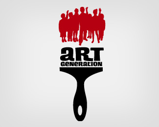
Logo presented for a program for a local art museum to get kids involved in art.
Status:
Unused proposal
Viewed:
34567
Share:


Lets Discuss
I like the concept, have you tried welding the bottom part together? I think if you have just the heads and arms that would be enough. and a nice clean bottom line to form the brush. Just my 2 cents.
Replyi agree with logomotive! nice one!
Replyi like it. i like the separation of the kids from the type because the white space between the kids hints at the white brush bristles. but logomotive's thoughts could work too:) either way I like it a lot.
ReplyTried it with just the heads and arms and it didn't get that nice look of the bristles of the paint brush. That's why we ended up using the whole bodies.
ReplyVery nice, cought my eye!
ReplyGreat concept.
Replyi love it, it looks very nice! floated
ReplyLike it a lot.
ReplyThat one is just great - I wouldn't change anything!
ReplyExcellent!
Replyi think this is a very well done logo. The concept and design is on point. I think even if you were able to fit the hands and heads only, it wouldn't be as effective as the whole bodies.
ReplyJust wanted to say thanks to everyone for the feedback. You'll all probably be amazed to hear the client didn't dig it.
ReplyAfter 18 years doing this...nothing a client does amazes me anymore. Their loss however.
Reply%5Emen!
Replylike it too
ReplyGreat concept AND execution. Maybe you'll be able to resurrect it for someone who does %22dig it.%22 Hey, maybe they just didn't like red paint! Not sure if I can say this on the post since I'm brand new here (get it, %22brand%22 new?), but the client may just be a putz.
ReplyVery nice concept %5E_%5E
Replyindeed very neat idea !
ReplyNice! I think changing the all red color of the painted children to a rainbow of colors*might be something to toy around with.. The red reminds me of blood.**
ReplyGreat idea, very nice execution, and nice choice of type
Replyreally a cool design I like the concept and execution.
ReplyClever. It's a cool concept.
Replythis is among my fave logos on the site... my only tiny issue is that when it's not full-size, you can't tell that the people are kids. aside from that, I love the white space and all the touches
ReplyAs one of the client decision makers, it's important to note there were several other directions and we choose the one we felt was strongest. **We felt the paint brush represented house painting not art and, as can be seen above, it doesn't work well small.**You can see the logo we chose on our website www.mam.org
Reply@ bnpelsoh, I can really buy your point after seeing this was for %22kids%22 but I also agree with Relevant in the fact that the current logo does not convey the %22art%22 message either. Perhaps this one could have been done with more of a artbrush rather than a paint brush. Good logo regardless.
ReplyLooks a bit generic to me.
Replygtbernstein, can you contact me about this logo?
ReplyHi Gtbernstein, I am looking for your contact everywhere but I can't find it, could you please contact me for this logo, my email adress is [email protected]. It's a bit urgent. Thanks a lot. Fanny
ReplyPlease login/signup to make a comment, registration is easy