Vittas (2005)
by sebastiany • Uploaded: Oct. 02 '08 - Gallerized: Oct. '08
")
Float
(Floaters:
50 )
Description:
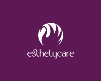
Vittas is a health care company
As seen on:
www.vittas.com.br
Status:
Client work
Viewed:
11622
Share:

Lets Discuss
Lovely.
ReplyNice type treatment, love the lingature.
ReplyNo type treatment.... we realy draw it!
Replythis LOGO was published in LOGOLOUNGE 4
Replythis one sure is classy, nice job
ReplyThanks Matheus!
Replylindo
Replyobrigado Leo
Replybeautiful
Replythis is beautiful, i dont see my self crafting a solution this gorgeus for this type of client
ReplyMe neither 6 years ago... (and this logo is from 2005) Is just a matter of practice and hard study. %0D*%0D*Many logo designers focus their creations in symbols only (cose is easyer), or at most a font adaptation. Nothing wrong with that (we do it a lot) if this is the best strategic solution for a brand. %0D*%0D*But many times a logotype alone is the best solutions, and many designers dont want to handle the difficulties of that. The ability to work with logotypes is the main outstand ability that our team posses.%0D*%0D*I am sure if you practice you will be able to do so, or even better than us.
ReplyLove the simplicity and style of this logo. Just love it.
Replysmooth look with beautiful curves a great brand for a health company congrats. %0D*%0D*nice one sebastiany
ReplyGreat wordmark!
ReplyHarmonica.Parab%E9ns!
ReplyThanks / Obrigado
ReplyVery elegant design%3B evokes great warmth. Glad to see it will be in LL4.
Replybeautiful sebastiany!
ReplyGreat works sebastiany and Co., lil thing that draws my attention is the middle t. for some reason I want to see it brought up so ever slightly, seems a hair too low. keep up your awesome work...
Replyi think you heard enough, but i have to say that this is one of the best type treatments i have ever seen, lovely.
Replythanks all. I agree with you Logomotive. This is from 2005. Today I would also increase the thinner lines in the %22a%22 and %22s%22. Don't you agree?
ReplyI kind of like how it is now , perhaps I but guess that would be a personal taste. Again it's a real beauty and %22any logo can be improved%22 as said by the great Paul Rand. I don't think I have ever done a logo that I look at and say %22no need to improve%22.
Replyabsolutely beautiful!
Replylove the balance and flow in this
ReplyThis is great. I can't believe your type is hand-drawn. Congrats, it's great
ReplyThanks!!!!
ReplyIt feels so light, congrats!
Replyouuh I like that.
Replythanks all!
Replyexcellent work!
ReplyThis is beautiful.
ReplyPlease login/signup to make a comment, registration is easy