Driving For Charity
by cerise • Uploaded: Oct. 01 '08 - Gallerized: Mar. '10
Description:
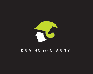
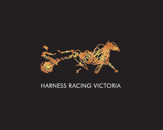
For a Harness Racing charity involving drivers of the horses.
Status:
Client work
Viewed:
15478
Share:
Lets Discuss
I love it!
ReplyThanks Fogra
ReplyGood one!
ReplyThanks Alen
Replysweet!
ReplyI see what you are trying to do, but when i saw the thumbnail, I initially saw a witch wearing a green pointy hat.
ReplyI Agree with gyui. Looks like a pointy hat.*Its still a good idea for a logo.
ReplyThanks for the comments. I didn't see the witch hat to start with then somebody pointed it out to me last night. Now that's all I see. I might have a play today.%0D*%0D*Cheers Cerise
Replyi see the concept you are going with, but like mentioned before it looks like a witch from the thumbnail. It also looks like the helmet is more baseball helmet looking, than a jockey helmet. The concept is there, just the technical side of designing needs a bit of tweaking.
ReplyNow I can't NOT see the witch.
Reply@joebarondesign it's not a jockey helmet it a drivers helmet, there is quite a lot of difference.
ReplyNice one, Cerise! Btw, who's that kid in ur avatar? :o)
ReplyThanks Saarwan, That's my Daughter aged 2 years, I also have a son aged 1 year.
ReplyCool. That's one cute li'l baby!
ReplyThanks man they keep you busy
Replylove it... best one of your portfolio!
ReplyThanks...It's not my fav but that's cool
Replyas we would say in england, the dog's bOllOx! nice work mate
Replysorry just a quick question. why do you have so many horse related logos in your portfolio?
ReplyThanks Paul :-) %0D*Answer to your question: I work in the industry as a Graphic Designer.
ReplySo clean. Looks awesome. :)
ReplyThanks Jess
Replyreally good. great job.**iLuv.
Replygreat job!!
ReplyThanks yummie and Kriando
ReplyThanks Nima
Replynice :)
ReplyThanks Magic
Replynice lines
ReplyHey thanks a lot Seb
ReplyLove this one! it looks together and easy to reproduce (embroidery maybe?) :)
ReplyNice mark Cerise.
ReplyThanks Rudy %26 Cseven%0D*@Rudy Embroidery Aaaarh! hope not.
Replyi love this mark, brilliantly executed!
Replyhey thanks heaps birofunk
Replyi absolutely love this..good work!
Replythanks a lot...mfrank appreciate it
ReplyI saw the horse right away phenomenal job!
ReplyThanks 100kg muse.
ReplyThats a lot
Replyactually 160kg is a lot, I'm not far off 100
ReplyPretty nice mark!
Replywow%5E rly wonderfull mark
ReplySymbol 10/10 awesome %7C font face and position.......8/10
ReplyHeHe ....Thanks for the marks out of 10, I hope you had the %22degree of difficulty%22 included in the score.
ReplyStraight to the winners circle, nicely done!
ReplyVery nice concept and looks great too. Excellent logo.
Reply%5E%5EHehe Thanks fellas.
Replygreat mark cerice
Replylove the statuesque icon, very chiaroscuro
ReplyThe type could be bigger and more inspiring.
Replygood 1
Replyi really like the concept.this is how even a simple design can be so effective.good job.
ReplyReally nice job!
ReplyNICE!!!
ReplyGood mark:)
ReplyThanks for the kind words
Replywow , brilliant
Replywhat a nice piece !
ReplyThanks a lot Ali and Bernd appreciate the kind words
ReplyThis is genius.
Reply%5E thanks for those kind words
ReplyPlease login/signup to make a comment, registration is easy