Abricot (2007)
by sebastiany • Uploaded: Sep. 15 '08 - Gallerized: Aug. '10
Description:
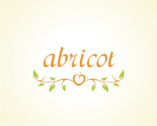
Abricot is a restaurant in São Paulo, Brazil. Abricot is a kind of peach
As seen on:
www.sebastiany.com.br
Status:
Unused proposal
Viewed:
7788
Share:
Lets Discuss
I like how the type matches the illustration in style. Is the type self made?
ReplyReally nice illustration!
Replythis one is really neat, love the typography as well. favorited!
ReplyYes, this is good. Just a though for consideration of an alternate version but what about going over the top and dotting the i with the apricot and branches scrolled out? either way this is classy good work.
ReplyThanks a lot for all the comments.
Reply@Fogra. Hi! Yes the type was made for this logo.
Reply... since all the team in our office answer as one in this profile here in logopond, let me just complete the last post... We almost always (95%25) develop the typeface for the Brand. This is what we do best, what we love, and it is what out-stand us (is that the word?) from many other design companies here in Brazil.
ReplyVery elegant. The typeface seamlessly matches the logo.
Replysweet. everything works nicely together. nice job.
Replyvery pretty!
Replythanks friends
ReplyPlease login/signup to make a comment, registration is easy