Biscon
by holajoan • Uploaded: Sep. 04 '08
Description:
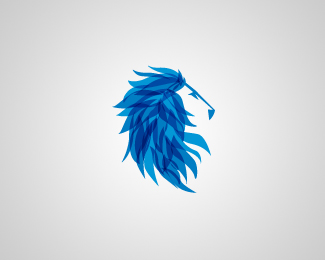
Logo for an english financial company
Status:
Nothing set
Viewed:
19240
Share:


Lets Discuss
looking good
Replythis one stands out, really amazing
ReplyIs this a lion, or a horse.**Either way, I'm loving it.
ReplyThis definitely stands out, but I'm also a bit confused as to whether it is a horse or lion. **Knowing that it is an English company I immediately associate the logo with a lion.**I think the snout need to be improved on. Either longer for a horse or shorter for a lion.
ReplyI don't care if it's a horse or a lion... Or lirse, or an horion! JOAN KILLED IT!
ReplyIf this is for a financial company, it needs to be strong and established and more solid. This is too abstract to represent a financial Co. Try more symmetrical and solid if that is your goal. It is unique however. Just my first initial reaction.
ReplyI like the mark, and definitely see a lion.
Replyexcellent
Replystunning
ReplyLooks really cool!
ReplyPlease login/signup to make a comment, registration is easy