by ranganath • Uploaded: Sep. 03 '08 - Gallerized: Sep. '08
Add to Pad (In 30 Pad s )
Description: Not used Status: Nothing set Viewed: 8996 Share:
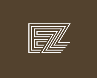
very cool. not quite sure about the shadow. but i like it very much
Nice concept, I agree with GabrielIRO about the shadow.
Also not happy with the shadow, but the form is very cool, remind me of those retro logotypes :)
the spacing in the diagonals seems a bit tighter than, the rest... it may be an optical illusion, i got light headed trying to be sure, but at first glance it looks closer.
Shadow and end the Z straight to form a block.. Makes a better brand I think
Nice one, do you sell it? If so, can you contact me at: mladensan%7B@%7Dhotmail.com , with the price. Really interested. Thanks
Great concept... I agree with tconrad about this spacing...
looks like the 1968 Mexico Olympics logo a bit. Same style.
Very nice, this is my brothers initials
Its nice to here azacarias... thanks for ur comment
Have you guys ever seen the EZ's restaurant logo and signage? this reminds me of that so much. http://www.ezsrestaurant.com
@The Critic*Wow.. It should be tough being you.
i'd have to agree. this logo's only similarity to EZ restaurant are the letters. there are probably quite a number of EZ somethings out there.
EZ boys.
Please login/signup to make a comment, registration is easy
Follow


Lets Discuss
very cool. not quite sure about the shadow. but i like it very much
ReplyNice concept, I agree with GabrielIRO about the shadow.
ReplyAlso not happy with the shadow, but the form is very cool, remind me of those retro logotypes :)
Replythe spacing in the diagonals seems a bit tighter than, the rest... it may be an optical illusion, i got light headed trying to be sure, but at first glance it looks closer.
ReplyShadow and end the Z straight to form a block.. Makes a better brand I think
ReplyNice one, do you sell it? If so, can you contact me at: mladensan%7B@%7Dhotmail.com , with the price. Really interested. Thanks
ReplyGreat concept... I agree with tconrad about this spacing...
Replylooks like the 1968 Mexico Olympics logo a bit. Same style.
ReplyVery nice, this is my brothers initials
ReplyIts nice to here azacarias... thanks for ur comment
ReplyHave you guys ever seen the EZ's restaurant logo and signage? this reminds me of that so much. http://www.ezsrestaurant.com
Reply@The Critic*Wow.. It should be tough being you.
Replyi'd have to agree. this logo's only similarity to EZ restaurant are the letters. there are probably quite a number of EZ somethings out there.
ReplyEZ boys.
ReplyPlease login/signup to make a comment, registration is easy