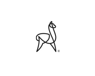
El-paca
by s7even • Uploaded: Aug. 27 '08 - Gallerized: Aug. '08

Float
(Floaters:
85 )
Description:
Proposed name and type treatment to accompany the alpaca I posted earlier. The company manufacture luxury alpaca fleece products.
Status:
Nothing set
Viewed:
22779
Share:

Lets Discuss
Well done!
ReplyNice %26 Clean %5E%5E
ReplyBrilliant! I'm allergic to wool but I would try to wear those %3B))
ReplyLove that continuous linework. Great looking mark.
ReplyVery nice. And this looks just like an alpaca. If it were me, it'd end up looking like a camel or something. Great, clean work!
ReplyFantastic, I love it.
ReplyMaumer, I really like the look, just curious though,.. was the way you did the single line just for style? It seems you could have achieved the same basic shape without overlapping lines.
ReplyThanks to all for the kind words.. *@ BigAl67 - good to see another kiwi on here! Not sure how it took me this long to stumble onto your work - nice showcase.*@ Logomotive.. The overlapping continuous line was indeed a style consideration. A simple outline of a silhouetted alpaca could probably have worked here also, but this was a great (and seemingly appropriate) opportunity to create something in this continuous line style. I have been fascinated with this style since it first came to my attention and just love the way the overlap makes it possible to describe the form of the animal (beyond the silhouette) in very simple and efficient terms. Initial feedback from the client was all very positive and also identified the connection between the linework and a single thread of yarn.
ReplyI almost forgot - type08 you will be pleased to learn that alpaca fibre is superior to wool (incl. cashmere and mohair) in all the ways that matter (finer, warmer, softer, more lustrous etc.) it also contains no lanolin making it naturally hypoallergenic.. downside is the yield is much lower than sheep or goats making it somewhat more precious (read expensive).
Replywow..simple elegant and superb..5 stars ..
ReplyI got it! Where can I buy it? %3B) Good work...
ReplyThis one reminds me of one of dache's.*http://logopond.com/gallery/detail/20815**Nice though.
Reply%5ENOT EVEN close com on. it' simple line art or single line art. geez people look around and experience the world. Enjoy,love one another and CREATE!
ReplyLovely logo! Beautiful illustration, Nothing like that link sent by Vivara. in fact its a better logo if anything.
Replyalways love a unending ties
ReplyExcellent work Steven.
ReplyGreat work. Well crafted.
Replythe alpaca looks great %26 expensive, very well simplified and that golden color rocks. don't love the typography though.
ReplyI like it :)
ReplyLovely mark - it's got a Felix Sockwell feel to it (that's a compliment btw).
ReplyThis is really cool and well executed, can't believe I haven't seen it. *cseven I agree and I love Felix's work
Replysmooth shape :) love it!
ReplyThis is sweet! Nice work.
Replywonderful.
Reply
ReplyBIG THANKS to everyone for all the kind comments... means alot when other designers appreciate my work :)
ReplySuperb!
ReplyThanks James :) - Thought I should update it with the approved colour-way.
Replysupergood )
ReplyThis is also a Club100 material!
Reply%5E Why there's no link to logos with 100 floats yet?
ReplyOne of the all time favorite logos.
ReplyPlease login/signup to make a comment, registration is easy