Singapore Govenment
by misterjones • Uploaded: Aug. 25 '08 - Gallerized: Aug. '08
Description:
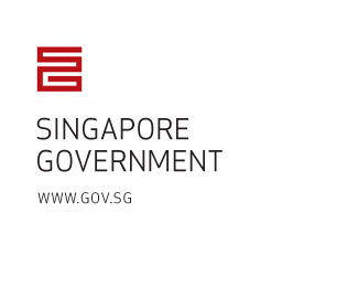
Just an idea i had.. Possible identity for the Singapore government, using their trademark SG in an iconic shape.
Status:
Just for fun
Viewed:
14762
Share:


Lets Discuss
I like this a lot... This is one modern government %3B) Great icon, nice balance with the typography...
Replythanks, it's just an idea though. They haven't actually commissioned me..**yet?*:)
ReplyThey should Mister J, they should... Good luck! :)
ReplyLove the simplicity of the mark and the font is nice too!
ReplyClever. It's modern and yet it seems to mimic an East Asian character. Interesting that you've dropped the national symbol. You could make a merlion out of the S and G %3B)
Replythanks firebrand, i see what you mean with the merlion, but i think it's time to drop that freak of nature :)
ReplyVery great logo, congratulations for idea :)
ReplyVery nice. Alas, this would never past muster via a government committee. It's way too nice for that.
Replyit ressembles me a bit of raja's brand. *anyway, it's a great logotype.
Reply@ darrel: you hit the nail on the head... after 18 months here working for huge corporations (quit a few governmental), i can only agree with your statement.
ReplyGreat mark - very Asian in look and feel. Love the simplicity of the type underneath as well.
ReplyNice and clean with an excellent concept! Congratulations.
ReplyI like so much your choise about the font... it's so clear... Good work..
ReplyNot so good composition though.
Replymade the icon a bit smaller, was too heavy. Composition is fine in my opinion.
ReplyI think the composition is really ok*stable design
ReplySimple and powerful. Congrats!
Replyit's a good mark. See you that: http://www.orangeonweb.ru/logotypes/soldis.html
Reply%3B/
Reply@ oximax, cheers for that soldis capital link, i see the similarities but can honestly say that i never saw this logo before - don't really like the type too. Mine was conceived making sketches on a piece of paper during a drink at a singapore bar - I think i still have those somewhere. It was originally intended for another (commissioned but unfortunately canned) huge project - related to singapore branding, but if i told you i'll have to kill you all.. :)
Replyi think this one is awesome however - at a government level, they're less likely to go with an 'monogram' logo and want a 'mark' of some type that represents the country. try to capture the feeling of the country or promote its assets - kinda like an 'olympics' style logo. the mark usually represents something about the country while also representing harmony, and competition.%0D*worth some thought anyway.
ReplyI believe you. It has happened to me also. It is very difficult to do a design that it does not remind to other one. Anyhow yours seems to me better
ReplyGreat stuff!
ReplyVery governmenty. Nice job.
ReplyVery clean...however does the URL need to be there?
Replynice
Replyyou punk!*you nailed it!
ReplyHey Mister Jones, do you mind me asking what typeface you used here? It's classy - not too corporate not too modern. Just right, as Baby Bear would say.
Replyjtroll, it's Apex Sans Book, by www.vllg.com
ReplyPlease login/signup to make a comment, registration is easy