Studio Linije
by Jovan • Uploaded: Aug. 20 '08

Description:
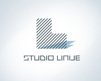
‘Studio Linije’ provides conceptual solutions in Architecture, so they wanted a simple but distinctive symbol. The one of the requirements was to visualize company name, because it’s connected with their philosophy: “The Architecture is the art of simple lines”. Idea was to develop a visual metaphor that will have several meanings. The main meaning is the symbol shape - letter L, the first letter of the company name. Another one is the tiny line texture, which corresponds to the company philosophy (also recognizable architectural element from the scaled drawings), and the last one is a building.
As seen on:
Status:
Nothing set
Viewed:
9969
Share:


Lets Discuss
like the mark, reminds me of,,..nevermind.
ReplyPlease login/signup to make a comment, registration is easy