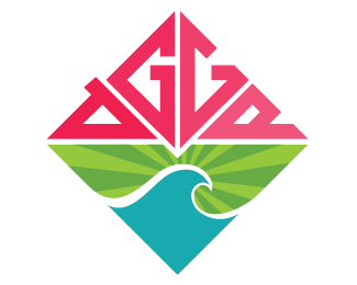
Agge Diamond
by Agge • Uploaded: Aug. 19 '08

Float
(Floaters:
1 )
Description:
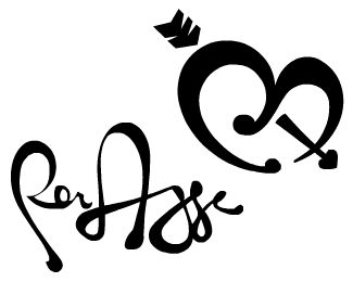
A personal logo I started working on yesterday. This one with a diamond shape.
edit: PLayed with the G's
Status:
Nothing set
Viewed:
7364
Share:
Lets Discuss
Overall, I think this could work with some further development. This version also works better in black and white than the color version posted. In addition, having two different G's is sort of confusing and I don't think it will translate that well to the viewer. Also, while the wordmark/type feels very industrial, the wave is more organic. The two different elements are competing. Keep pushing through this one and keep the color minimal and simple and you'll have a winner. :-)
ReplyI think if you cut the A ( where the stoke is hanging over) so the line was at a straight angle, and took the first G, reflect it and place where the second is you would have a more concise diamond shape and it would flow much better. Just a thought. :)
ReplyOcularink: Will play around with the G's and I have already made slight changes to it (will upload later). I personally think that the color version is nicer and with a nice colorscheme. I doesn't agree with you on the fighting elements thing. I feel it kind of gives it a cool balance between hard and soft, corners and curves, black and white, jing and jang (you get it:P). Thanks for the comment.%0D*%0D*NeilMcDonald: Good thought, but I'm afraid that the A might look like an O if I cut the little stroke hanging out. As said, I will play with the G's and see what I come up with.%0D*%0D*Really appreciate your input guys!%0D*
ReplyNow, i've changed the G's, the wave and the a slightly. What you guys think of it now?
ReplyThis looks like it could be the next big surf brand. Same sort of feel that roxy, volcom, rusty etc give. Cool
ReplyGood points guys. Feel free to tell your thoughts of possible modifications to it.*:)
ReplyJust a thought... What if you duplicate the AGGE part, flip it vertically and loose the wave?! This way, you could get the diamond-like structure to, even write the name twice, like it's a very special diamond there :))... JMO...
ReplyPlease login/signup to make a comment, registration is easy