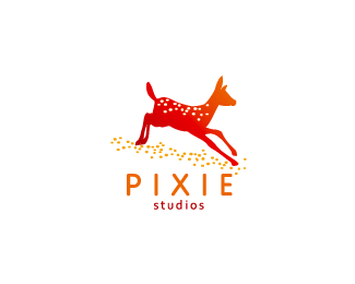
pixie studio
by rambal • Uploaded: Aug. 14 '08 - Gallerized: Aug. '08

Float
(Floaters:
23 )
Description:
pixie studio - motion . print . web
Status:
Nothing set
Viewed:
23520
Share:


Lets Discuss
nice color
Replyyep very nice colors!
ReplyDo you really need the shadow?......Great Logo!
ReplyRambal, I actually preferred the first one with the fawn as fawns are more associated with those spots. have not seen too many bucks with fawn spots.
ReplyThat shape of the buck is too much like the john deer logo for me.
ReplyI agree with borniagge... This logo without shadow is perfect!
ReplyThanks to all...%0D*%0D*@: logomotive: This is a special category. this is an Indian Deer. %0D*Name: AXIS DEER, it has dotted spots in his body like fawns.%0D*%0D*@ borinagge: design is basically light and shadow only. I do agree with the mark is better than without shadow. But I prefer this one. %0D*
Replynice, however deers are a bit dated...5-to-6 years ago
Replydeer are so '03
Replyyeah!.. 12.03 this afternoon!
Replyit would be great at christmas, apart from that it looks cheesy.
ReplyI agree with Lawrence, i see the John Deer logo*http://www.direct2farm.com/warehouse/images/JohnDeere-Logo-4C-Lvert%255B1%255D.jpg
ReplyDon't like the deer.
ReplyPlease login/signup to make a comment, registration is easy