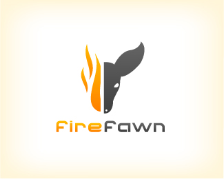
FireFawn
by Siah-Design • Uploaded: Aug. 11 '08
Description:
Logo for a personal project (firefawn.com) Updated 1x
As seen on:
Status:
Nothing set
Viewed:
6273
Share:



Lets Discuss
I like the concept. But the fawn's ear looks odd to me -- seems too big for its head.
ReplyThanks for the comment KHDZN. Well, it may seem a little odd, but a fawn's ears actually are that big. I dunno... If I make the ears smaller it may look like an adult dear. **Any other impressions?
ReplyI guess baby deer grow into their ears. :)**Great color combo. The text seems too tightly kerned. I think it might be easier to read if it was let out just a tad. Other than that, I think it's great!
ReplyYea, I think agree with you about the kerning. Spaced it out a bit more.
Replylove the concept siah, also agree on the ear :) good luck!
ReplyThe type is much better now. Good luck with your project!
Replynice one. how about trying to make the fire assemble to the rest of the head?
ReplyThanks guys! @matheus: Hmmm, good idea. I tried doing that a bit but never got it quite right. I may post an updated v. soon.
ReplyOne of the better logo's I have seen for a while. Love the style, composition.
ReplyPlease login/signup to make a comment, registration is easy