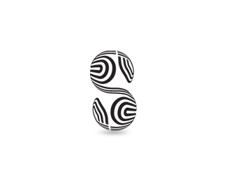
not a big a fan of this...sorry.*the mark seems as mentioned before very ambiguous (which may not always be a bad thing)...but you've got some really odd negative spaces, and i'm not sure the swirls in the back are adding much to this form/shape except clustering it all.**the type choice also seems off, and disconnected... the fact the colors are the same is the only thing to unites them


Lets Discuss
love it!
ReplyThis is very cool! Beautiful work :)
ReplyIn my opinion, the iconic part of this logo is ambiguous.
Replynice concept but you can change the color scheme to original brain :)
Replycool mark - pure energy
Replyawesome colours.
Replynot a big a fan of this...sorry.*the mark seems as mentioned before very ambiguous (which may not always be a bad thing)...but you've got some really odd negative spaces, and i'm not sure the swirls in the back are adding much to this form/shape except clustering it all.**the type choice also seems off, and disconnected... the fact the colors are the same is the only thing to unites them
Replythe logo is way too busy, looks like ...color snakes, plus the type is bad. Sorry.
ReplyPlease login/signup to make a comment, registration is easy