Logo CONCEPT 01
by Muamer • Uploaded: Aug. 04 '08

Float
(Floaters:
63 )
Description:
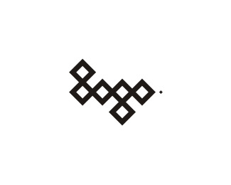
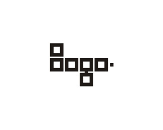
This logo is made when I was trying to design my own logo (remember the smiling logo man with glasses:) At that time I experiment with word "logo" a lot and I develop several different concepts, this logo here is one of them. I think is interesting to show you this versions also... So here it is, another logo for logo :))) © Muamer ADILOVIC DESIGN // MA:DE
Status:
Nothing set
Viewed:
9855
Share:


Lets Discuss
I think it's great... immediately read as logo to me even though you wouldn't normally associate two stacked circles with an L
ReplyVery clever, Muamer.
ReplyI like this circle version best. Very nice. And surprisingly legible.
ReplyLogo-a-gogo
ReplyMaumer... love it. But it reminds me a tad of %22dopod%22http://www.dopod.com/pc/DiamondIndex.html their logo is on the actual phone. Not saying a rip just similar in creation using repeating shapes.
ReplyMaumer... love it. But it reminds me a tad of %22dopod%22:http://www.dopod.com/pc/DiamondIndex.html their logo is on the actual phone. Not saying a rip just similar in creation using repeating shapes.
Replyit's quite strange, I also read 'logo' even with a %22non-L-looking%22 'L'. Nice idea
Replynice - i wonder how good it would look if maybe the g? was a nice red colour perhaps?**
Reply: Thanks everyone, happy to see you like it ! ! ! %3B-) **@ Bart : Thanks :-) OOOOO Circle is always circle they all look-a-like :))) Yes, there is some light similarity in idea but realization is different, I use only one shape (element). I must tell you that I never see that dopod logo before! Man, that logo is WoOoW: very very good !!! **@ Matheus : Yes, that %22 l %22 is funny... Thank you :)**@ danny : Thanks. But - why %22g%22 only ?
Reply@muamer: i just think it would look cool :D help to break up the chain of OOOO and add a bit of colour to the mark. just a thought dude :)
ReplyThank you Danny once again :) I try - but that emphasize %22g%22 too much... Don't worry I have color versions of all this logos %3B-)
ReplyI think the simplicity (including the use of monochrome) is what makes this so elegant.
ReplyThank you Gthobbs. %22Less Is More%22 :-)
ReplyI like it too.*Shame you can't register the name.
ReplyThanks martart : Yes I can :)))
Replyconsidering the context of this website (a logo website), i read it as %22logo%22 but i can see how it can be confused for Bogo or something else in a different setting.
ReplyYeah, in some mathematics sites this logo will be read as: 8080 :))) **This is made for logo design site / or anything related with logo design, so don't be confused !
ReplyI like this one the most... Looks like the symbols on that golden plate we've sent into space... And I agree, it would work crazy on some logo design site...
ReplyPS sto sam sve vidio u galeriji stari moj, ovo mora unutra 300%25... Kriteriji su im fakat cudni, u najmanju ruku... Peace!
ReplyType08: Thank you, I really appreciate it :-) Heh, ma znam, sta je tu je :))) Hvala ti jos jednom. Hey daj nam jos tih tvojih super logotipa... Peace*
ReplyNo, thank you! %3B) Coming up!
ReplyHi Mauer!*I Found This Yesterday.*http://www.log%F3tervez%E9s.hu/*
ReplyI think somebody saw your showcase...*
ReplyI personally don't feel that the logotervezes version is a direct copy of muamer's logo. For one, muamer's %22L%22 is different. If he was going to rip off the logo he probably would have just copied it verbatim, which he didn't. And not to say that muamer's logo isn't brilliant, because it is, but I don't think it's too much of a stretch to come to the same conclusion that 2 circles stacked on top of one another form a simplified %22g%22.**I'm not defending the logotervezes guy, it's very possible he could have copied muamer. But I also think that it's a simple enough concept that he could have come up with a similar approach entirely on his own. Remember, it's a big world...
ReplyThanks logocento, but I agree with sdijock ( thanks man %3B)... No copy here
Replywhat i love about this is the %22L%22, its more logical to be %22b%22 or %22d%22 but i can only read it as %22L%22 and thats what makes this logo amazing.*good job
Replyawesome!
ReplyNadim %26 erzio: Thanks a lot!
Replyhey dude!*remember my logo design with the circles? %22the logo%22*here: http://logopond.com/gallery/detail/47949
ReplyHey Brandcore, yes I remember. Thanks for the link, but I don't feel that Jav's version is a direct copy of my logo here. Similar? Yes, but not copy... Look at the %22L%22 and %22G%22 %3C enough differences...
Replystunning!
ReplyThank you, T%F8mme! :)
ReplyIts simple, Muamer! where are you boy?!
ReplyHey Thanks, Pierro! Working, working, working...
ReplyPlease login/signup to make a comment, registration is easy