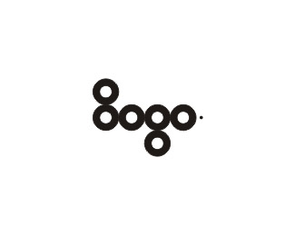
Logo CONCEPT 03
by Muamer • Uploaded: Aug. 04 '08

Float
(Floaters:
18 )
Description:
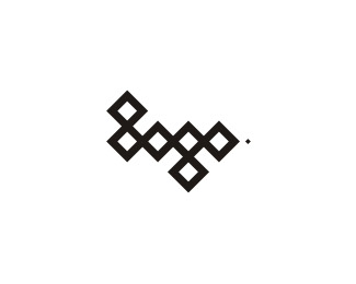
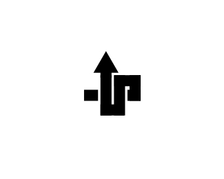
This logo is made when I was trying to design my own logo (remember the smiling logo man with glasses:) At that time I experiment with word "logo" a lot and I develop several different concepts, this logo here is one of them. I think is interesting to show you this versions also... So here it is, another logo for logo :))) // © Muamer ADILOVIC DESIGN // MA:DE
Status:
Nothing set
Viewed:
14714
Share:

Lets Discuss
well, everyone likes the circles more, but In my view, this one is actually my favorite of the three. Fav'd !
ReplyPS: also, I think that if you do the same you did here on the 'G' in the cicles (making a small cirscle connecting the two parts), would be 10/10 IMO
ReplyI like this one more then the circles. Its just me of course, but it seems there is something else here then the others**PS: also, I think that if you do the same you did here on the 'G' in the cicles (making a small cirscle connecting the two parts), would be 10/10 IMO
Replyi like all these.. very good.. %26 an excellent showcase too!
Reply@ Matheus: Thanks on the tip***@ Nido: Thank you very much :-) Your showcase is one of my favorites on LP
ReplyPlease login/signup to make a comment, registration is easy