Phoenix 168 (Concept)
by koodoz • Uploaded: Jul. 29 '08 - Gallerized: Aug. '08
")
Float
(Floaters:
11 )
Description:
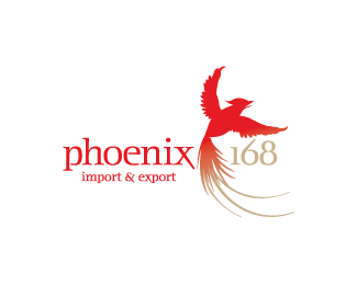
Revised concept for Chinese-Vietnamese importer/exporter. I refined the symetry of the bird and gave more definition to the head. I also changed the type, think the new font suits the symbol a lot better.
Status:
Unused proposal
Viewed:
3955
Share:


Lets Discuss
I kind of liked it more in red (the connection between the flames and the names) :) It works fine this way 2...
ReplyI still think it looks like a squid - you should modify the flames.
ReplyThe 168 that the flames create is the key feature of this logo. Maybe I could work on the appearance of the neck and head...
ReplyDude - I didn't even see the %22168%22 in the flames - it could just be me though, because I saw it after you had pointed it out. I think if you added another layer of flames in a darker orange behind the %22168%22 to help fill in the gaps it wouldn't look so squid-like.**And I think you should address the head as well.
Reply@smartinup: Woohoo! I made a 'nugget' :) I was a bit concerned that no one had mentioned the 168 in the flames, obviously it works a little too well.**@sdijock: I like the idea of adding more flames, I just hope it doesn't detract too much and make it harder to see the '168'. I'll also see what I can do with the head.**I've already submitted the concepts to the client, so if he likes the direction of this one (and I'm confident he will) I will work on it more with your suggestions.*
ReplyThere are no squids here man, the numbers are really obvious... Wait a minute, what do they stand for anyway?!?! :)
Reply@Type08: It's a bit odd, but only because I'm an ignorant westener, but apparently the numbers are popular in chinese culture. From my brief notes, 16 %3D Longterm and 8 %3D Prosperity. Off the top of my head I think 8 means something else, perhaps fortune or luck (?) as it is a major number with the olympics which will start at 8.08pm on the 08.08.2008.
ReplySay no more... Like it even more now... Squids... Ah...
Replyme too. :)
Replyme three! sweet!
ReplyYes!!! I managed to deceive quite a few of you with the hidden flames. Yay for me :P
ReplyOh my....Cleverness!
ReplyI still think that client had to chose this one! Where have you been Koodoz? :)
ReplyYeah, I thought they had chosen this logo too. The client turned out to be a very difficult and dodgy one - almost 4 months with numerous 'missed calls' and ignored emails, just to receive payment. By the end of it all, they completely changed their mind and went with the other logo. Good riddance I say!**Where have I been? I've been lurking around the site, but have been too busy to make my presence known :)
ReplyTotally hear you my man, have a few of 'those' myself... I hate that! I HATE THAT! Good to see you around though... :)
Replyhey, this is very very nice too!
ReplyThanks tass!
ReplyPlease login/signup to make a comment, registration is easy