moah
by s7even • Uploaded: Jul. 27 '08 - Gallerized: Jul. '08

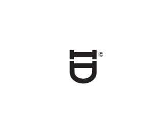
Float
(Floaters:
33 )
Description:
New mark for UK based snowboard outerwear company. Based on japanese woodcut symbol/seal.
Status:
Nothing set
Viewed:
11747
Share:


Lets Discuss
A bit hard to read (looks like MPAH) but I like the flow... Fits for the cause...
ReplyI read it perfectly and i love it
ReplyVery strong. Fits the segment well.
ReplyGreat concept
ReplyNice!
ReplyGR8 ! Very good use of japanese woodcut symbol/seal. %0D*
ReplyI actually thought of winter outerweare when I saw it – dunno why, because it doesn't say snowboard, winter or has any cold colors.*Like the way the letters run :)
ReplyNice... one of my favorite. Keep up the good work.
ReplyNice, I like the consistency of the shapes.**Does it work with less space around it?
ReplyThanks for the kind words everyone...*@ Type08 I appreciate that the %22o%22 could perhaps be interpreted as a %22p%22 - a compromise was necessary in order to keep the letterforms linked without disrupting the eyeflow. I dare say the extreme/snowsports market is one where readability is not as crucial as the aesthetic.*@ Rein, I initially had the mark reversed out of a fairly close-fitting stamp shape to enforce the woodcut/seal concept and this worked okay. I left it for a while (I find its a good idea to take a break from developing a mark and almost forget about it then take another look to get a less biased/fresh perspective) and when I revisited it I realised it worked better with space to breathe. I guess (as always) simple is best. Less is more. Insert further design-purist cliche's here...
Replywant that snowboard outerwear just for the logo %3B)
ReplyVery similar to the Asia-Europe Business Forum, although since they are both inspired by Japanese woodcuts I can see that being coincidental.**http://www.identityworks.com/also_noted/AEBF.LOGO.GIF
ReplyI'm not sure I agree with the last comment. I believe this a very strong and engaging use of typography. **Nice Less is More approach!**
ReplyThis is great! Love it!
ReplyTotally awesome. Nice job dude.
ReplyPlease login/signup to make a comment, registration is easy