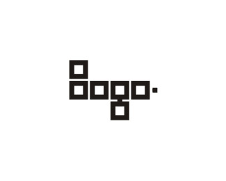
UP
by Muamer • Uploaded: Jul. 21 '08 - Gallerized: Jul. '08

Float
(Floaters:
42 )
Description:
Urban public apparel, freestyle fashion: UP!
© Muamer ADILOVIC DESIGN // MA:DE
Status:
Nothing set
Viewed:
27046
Tags:
up
Share:

Lets Discuss
I like this too. Wonder how it would feel with radius corners.
ReplyHmmm, I will try... Thanks Batma... I mean gthobbs %3B-)
ReplyLooks good, but feels a bit heavy. The rounded corners might help or maybe just some more breathing room between the shapes.
ReplyLooks cool, and works just the way that it is. **For fun I would try to start my stroke out half the size smaller and let it finish at full size to see if it did anything to make it look more exaggerated towards up.
Replycongratz Maumer ! top notch stuff as always
ReplyI like the way it is, thumbs up!
ReplyThank you all very much! %3B-)**@creativeheart: Hmm, that can be interesting too...
ReplyThis is very well, perfect example of expressive typography.
ReplyThanks Tariq, Nima and Sanjay. I appreciate it. :-)
ReplyLove it... love the composition and the rythm
ReplyBig Thanks, Marolo :)
ReplyThank you Demiphonic!%0D* %0D*%3C This is basic BW look - I have colour versions, don't worry... %3Bo)%0D*
ReplyNice... Nice...
ReplyThanks... Thanks...
ReplyLooks like a new identity that Blk/MRKT did fr 7UP.....
ReplyNope! Check it out again %3E %3E %3E
ReplyPlease login/signup to make a comment, registration is easy