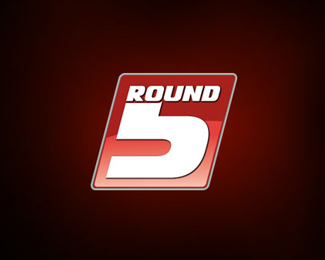
Round 5
by junian • Uploaded: Jul. 16 '08 - Gallerized: Jul. '08

Float
(Floaters:
26 )
Description:
Round 5 Mixed Martial Arts Logo. Letters make up the icon.
Status:
Nothing set
Viewed:
35484
Share:


Lets Discuss
insane.**Brilliant idea, although a bit hard ot read the first time, very well executed i still think !
Replywoah! very cool!
Replyvery nice. as said a tad hard to read so it might need typo with it.
ReplyVery clever, although I thought it was supposed to read %22round 50%22
ReplyI initially read %22Sound%22. This is really cool, but kind of hard to make out at first.**Nice work.
ReplyInteresting approach. I agree with gthobbs about adding typo.
ReplyNice boooom
ReplyI can so see this on a Gi!
ReplyI can't read it, but looks great.
Replypretty strong but i cant deny comments about type corruption.
ReplyI initially read %22Ground%22
ReplyV Nice! clear %26 punchy**but seriously dont add typo it reads fine, if people have to take an extra second to read it they'll remember it better, and if they still cant read it you should probably check they can tie their own laces and definitely steer them clear of MMA.
ReplyThis is great! I would play with the readability a bit though. I thought it said Sround at first and many others read different things. Could you punch up the %22r%22 or the %225%22 to make the more distinct?
ReplyIt wasn't easy for me to notice the 'round5' in the logo, the only thing I saw was this cool fist. Good job, I liked it.
ReplyPlease login/signup to make a comment, registration is easy