BirdWatching
by actiondesigner • Uploaded: Jul. 15 '08 - Gallerized: Jul. '08
Description:
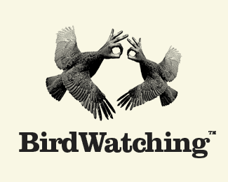
BirdWatching is the name of a project involving birds you might not have seen before ...but they do have sertain characteristics and behaviour that we can relate to:)
Status:
Nothing set
Viewed:
8058
Share:
Lets Discuss
Fantastic!
ReplyThanks:) You should see how these birds breed. Its just insane
Replythat would make a great t-shirt. (if you make one, please send it to me. i'll send you a mixtape in return or something.) excellent typography, by the way, i love chunky serif fonts.
ReplyI actually plan to ...not my idea though. But I would definitely send one to you. You have my word:)**How about this one for a t-shirt? :-)*http://www.actiondesigner.com/img/extras/mating.png*
ReplyIt's as if Thing from The Addams Family mated with a pigeon...
Reply@smartinup*I saw that also and just kept it that way ...a bit subitle:)**@jguay*I buy that theory:)
ReplyI agree. Love chunky serifs when used appropriately...your use is very appropriate! Looks great in greyscale. Good work!
ReplyL-0-V-3 the negative space... flagged it.
Reply...just peeked through your profile and love the progression your work has shown. Visually and conceptually they continue to get better and better, fantastic stuff...really love it.**(Oh and by flagged it, i meant i added it to favorites!)
ReplyLove the negative space? Am I missing something in the negative space?
ReplyI think that the circles of the hands are supposed to resemble the %22birdman%22 thing if you know what I mean- it forms eyes in the negative space (not so much negative space as an invisible head/eyes).
Replyregardless...it makes me smile
ReplyThanks for all the feedback:)**@Relevant %26 CKeil: The birdman resemblance was not intentional:) Neither the negative space at first, but it was obvious when I put the two shapes together**@tconrad: Always happy when someone likes my work. Very humble %26 grateful. Thanks**@hindmarshdesign: The choice of type was easy in this case and feels right. Happy you feel the same way**@Radhacelis: Morphing bird and hand is a good base for a creepy feel. The idea is to make it creepy and different. The colours and overall contrast I feel enhances the creepyness even more.**@gthobbs: always glad to put a smile on your face:) I must have done something right
ReplyThis one is off the hook! Tariq is right, it brakes the boundaries of a logo...
Reply@tariq-design*Because the logo is too detailed ...or is there any other reason? I guess it is based on your predefined understanding of what a logo is that doesnt make this eligible**@Type08*Dont know if you are being sarcastic:) or that you feel the same as tariq-design? Im just guessing you are with me on this then?!?!:-)**Anyways ...very greatful for all the feedback guys:
ReplyWith you... Love it... Great stuff...
ReplyPlease login/signup to make a comment, registration is easy