Home
Gallery
Activity
Creatives
Sign In / Register
Featured
Beauty Spa Salon Logo
Proffalices
Float
Spartan Technology
Costoboc
Float
White Eagle Logo - A Symbol of Strength and Vision
Dainogo
Float
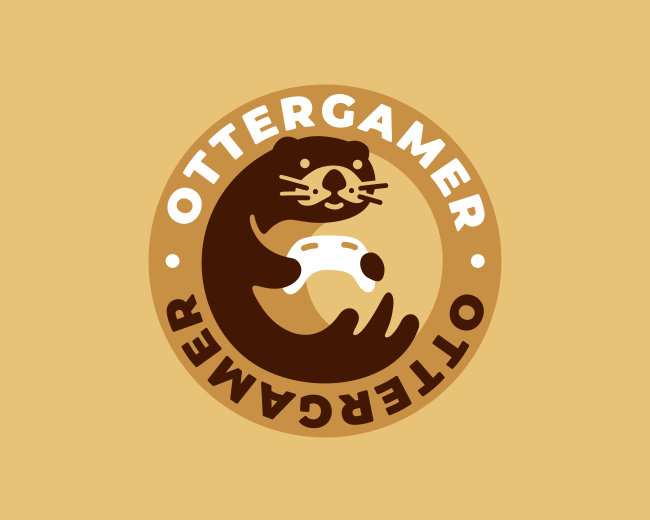
Otter Gamer Logo
Nagual
Float
Free Bird
Costoboc
Float
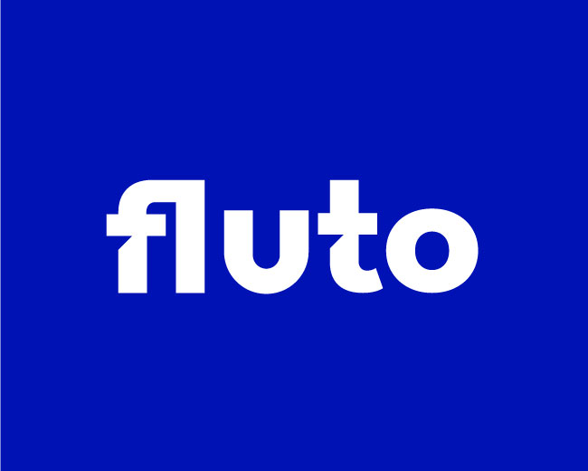
Fulto Logo - Fintech Company Logo
Rakibul62
Float
Child Health Nurse Logo
Proffalices
Float
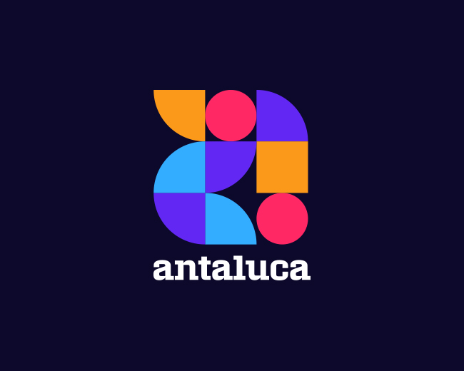
Razvan Antaluca Visual Identity Design
Cajva
Float
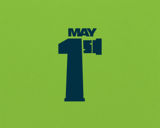
May 1st
Ambi
Float
Deer Beer
Ambi
Float
Bear Laundry Cleaning Logo
Proffalices
Float
Cute Tailor Mascot Logo
Proffalices
Float
Brain, Infinity, Chat, AI Logo
Artology
Float
Snake Charmer Hunter Logo
Proffalices
Float
Ink Screen Printing Logo
Proffalices
Float
More
Featured Artist: mikylangela
Follow
mikylangela
Logos :
122
Pet Lock
Mikylangela
Float
SMT
Mikylangela
Float
Oranta
Mikylangela
Float
Welcome Hotels
Mikylangela
Float
Fox
Mikylangela
Float
Pigeon
Mikylangela
Float
PrimaVista
Mikylangela
Float
Alvinet
Mikylangela
Float
PecuniaToday
Mikylangela
Float
Motoraccoon
Mikylangela
Float
MyVox
Mikylangela
Float
Libhof
Mikylangela
Float
ArtBloom
Mikylangela
Float
PMStudio
Mikylangela
Float
Ugnui Dom
Mikylangela
Float
Western Man
Mikylangela
Float
Pelicannes
Mikylangela
Float
HydroStyle
Mikylangela
Float
DriveBestWay
Mikylangela
Float
Dr Einstein
Mikylangela
Float
Recent Discussions
barkolog
good work
danadaster
aaaa
Rakibul62
@xsights
Thank you for your comment
xsights
great design.
danadaster
Every student who intends to apply to a college or university must write a personal statement. It takes[...]
danadaster
@Chirag7
@Chirag7
nice post
More
Creatives
TypeAndSignsHamburg
Follow
0 Identities
Following 23
808 Followers
Follow
artology
Logos :
302
Follow
Rakibul62
Logos :
187
Follow
rox
Logos :
212
Follow
Proffalices
Logos :
390
Follow
ImonUix
Logos :
84
Follow
migcabrera
Logos :
16
Follow
Luigi1818
Logos :
54
Follow
brandwatchmx
Logo :
1
Follow
mikylangela
Logos :
122
Follow
rumzzline
Logos :
43
Follow
designer
Logos :
104
Follow
AdamTheNumberOneMan
Logos :
26
More
Logopond © 2006 - 2024
Contact: Management
|
Terms of Service
|
Privacy Policy
|
Advertise


good work