Transformation
by ROCKKIT26 • Uploaded: Jul. 07 '08 - Gallerized: Jul. '08
Description:
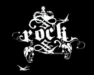
Logo used for a company that wanted to do an internal re-org of the staffing structure.
Status:
Nothing set
Viewed:
23222
Share:
Lets Discuss
The Non-Format look is a bit played-out, but this is nicely executed.
ReplyAgreed.
ReplyI don't agree. I think the design is brilliant.
ReplyI agree with mattersbold, excellent logo. Very creative and bold. Nice to see something original for a change that's more than just a ripped off font with a ripped off mark.
ReplyI love the people in there, too. Took me a minute to notice them, but very nice touch. Love the whole thing.
Replyisn't this too much for a logo ..%0D*I like the colors .. but there are too much deatails..
ReplyI like the design you have going on, however I believe that it's way too complicated for a logo. There is too much detail, which makes it too busy. *I would try scaling the logo down to see if it still translates the same way, and also try the logo in grayscale to see what it looks like too. A good logo is always scalable and can still be recognized in black and white. I like where you are going with the design, but I do think it's a bit too complicated as an identity mark.
ReplyI agree that this may cause some complications if a smaller application is required but I love the way the creativity took over and usurped the rules. Too often truly fun and creative designs suffer because we try too hard to %22colour between the so called lines%22.
Replylove!
ReplyI think the creativity here wins over all the rules.
ReplyPlease login/signup to make a comment, registration is easy