CINQLEO
by HelveticBrands • Uploaded: Jul. 04 '08 - Gallerized: Jul. '08
Description:
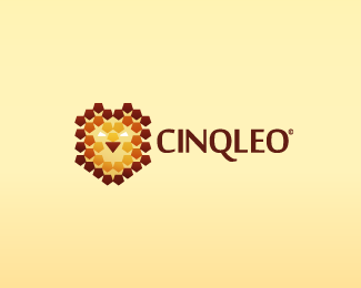
Cinqleo is a software company in Switzerland specialising in network solutions for medium to large size companies. Their company name is in reference to their five members and the fearless attributes of a lion. Cinqleo requested a bold symbol to accompany their launch this autumn. Their identity is based entirely on five sided shapes which come together to form the head of a lion
As seen on:
http://www.dache.ch
Status:
Nothing set
Viewed:
15237
Share:
Lets Discuss
Clever. I saw the lion right away.
ReplyNow were talking, and the colours are spot on too %3B) Strange presentation though
ReplyCinqLEO, Very nice and clear... Nice typo too.
ReplyGreat name to work with. And a great work on your side. Personally, I couldn't see the lion at thumbnail size but that's because of the colors.
ReplySweet, really something different!
Replywow! really clever using of the pentagon shape. Very very nice.
Replycreative !
Replyworks for me :)
Replyoh please mate ... %3B/
Replyfrom distance looks better. nice work, like it.
Replyomg, that is very clever!*Seriously, how do you come up with such great ideas!?*I love every single logo of yours!
ReplyVery cool :)
ReplyAwesome logo David!
Replynice logo. the nose has only 3 sides though :)
ReplyThanks to all for your comments.**oveman, that is incorrect. You can see a big version of the logo at the %22Cinqleo%22:http://www.cinqleo.com website.
ReplyToo me the execution would have been clever to utilize the shape for the entire design of the head. Varying in form and size this could have been pulled off. The nose at smaller sizes does not sell the five concept in this aspect nor do the eyes. This in return makes the mark seem halfway planned and given up on.
ReplyThis is the best option and my client and I are entirely satisfied with the results. What you suggest was already tried as I am very thorough in my research. You really have no idea how much time was spent in planning this so kindly keep your disrespectful assumptions to yourself.
ReplyThis is funny how you can make comments on others threads in the same context as I have done but when others critique your work as you do theirs you get offended and say that they are being disrespectful. Dache I am making a observation based on the input that you have provided above and in the comments. Not being disrespectful. Just doing what you told us to do by not red flagging this mark. Trying to offer up a opinion with you is pointless. If you do not want a designer to truly critique your work then why post it to a forum style website where you have no control over the opinions.
ReplyThere is no green flag, but thanks anyway.
ReplyI know. It says %22don't care either way%22. Just to correct you. %3B)
Replyclashmore, trust me it has been researched, having a regular pentagon for the snout just doesn't look good.
Replydemiphonic, I might write a %22dacheboard%22:www.dache.ch/thedacheboard article on this project, time allowing. If there are any case study requests of projects in my portfolio that are not on the %22dacheboard%22:www.dache.ch/thedacheboard that you would like to see addressed drop me an email at info@dache.ch and I will look into it.**Thanks for the comments.
ReplyNice mark dude but mixed on the type, (just an observation) maybe just me but the mark seems very bold and geometric - almost assured while the type leaves me feeling wishy washy ... or it could be the Q or the N throwing me off ... but nonetheless tidy GOOD JOB
ReplyOn the contrary, i feel that this typography works tremendously well here... just feels perfect...
ReplyThanks guys, both very interesting points.
ReplyThank you***** *
ReplyPlease login/signup to make a comment, registration is easy