Earth Friendly Chemicals Type
by creativeheart • Uploaded: Jul. 01 '08 - Gallerized: Jul. '08

Float
(Floaters:
36 )
Description:
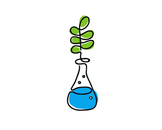
The client went with another option, but this is what it looks like with type.
Cheers,
Cody
Status:
Nothing set
Viewed:
12769
Share:


Lets Discuss
I like the illustration. It helps with the 'friendly' feel. What was the idea behind the circle after the 's'?
ReplyI could be wrong, but that looks like it could be a registered symbol%3B (R).*I agree about the illustration being %22friendly,%22 but I have mixed feelings about the type. It doesn't seem to quite have that same feeling. Then again, maybe it doesn't need to. Anyway, good work!
ReplyI'm thinking the circle is either a registered trademark symbol or it's a play off of the bubbles found in the mark. Not really necessary in my opinion. And if it is a registered trademark symbol, it might be too small. Even so, this looks nice with type too.
ReplyNice job. Excellent contextual application... takes a serious subject and adds friendliness. Many logos are too stiff these days so it's nice to see something cheerful.
Replygreat mark. agree that the type doesn't quite match, though.
Replyi like the type, it gives the overall look a professional feel but doesn't take away from the icon... well done
ReplyThis logo reminds me : http://logopond.com/gallery/detail/24327*1 constant line.*Nice.
ReplyLove the mark! It has so much raw personality.
ReplyPlease login/signup to make a comment, registration is easy