Pangur Glass Craft
by Fogra • Uploaded: Jun. 25 '08 - Gallerized: Jun. '08
Description:
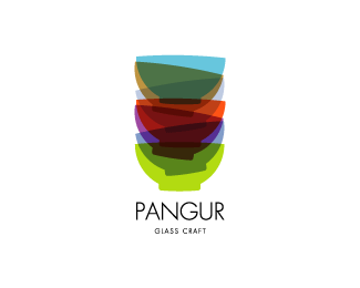
Stacked glass bowls. Company supplying materials, tools, equipment and training to the glass craft industry.
Status:
Nothing set
Viewed:
58618
Share:


Lets Discuss
I love this one!
Replyvery interesting!
ReplyIt would be interesting to see how this works in black and white without the transparencies. Great colors!
ReplyExcellent logo. Love global feeling and colours.
ReplyVery nice. The colors get a little muddy. You might need to choose the overlap colors custom rather than just a simple transparency multiply. Nice thought.
ReplyThanks chaps :)*@OcularInk: It can work in greyscale alright but not in solid black unfortunately.*@gthobbs: The colours do get muddy and I did try the 'overlay' option but it disappeared completely - maybe I'm doing something wrong :/
ReplyThis is nice, have you tried using less bowls? I think it could work in black and white if you look at trying to use the outlines of the bowls...
ReplyThat's what I mean about the colors. You might not be able to just do it with an automatic overlay or multiple. You might have to actually cut it up and punch out the shapes so you can apply custom color to each section. Still looks good though.
Replyfantastic fogra.. really well done!
ReplyCheers mate - really appreciated :)
ReplyLove it Sean. Marvellous, mate!
Replylooks cool, what tool have you used ?
ReplyVery friendly little logo. Nice work!
ReplyVery nice! Love the colours.
ReplyTop Job! Admittedly it looked a little overdone on the home page thumbnail but seeing it enlarged a little and reading the context for which it will be used makes a huge difference.
ReplyThanks again for the huge compliments from everybody.*@vimal: In Illustrator I used the 'transparency' window and selected the 'multiply' option under the 'blending mode' in the drop down options list.
Replyawesome! very beautiful logo!
Replyi like it very much
Replyabsolut beaut cant take my eyes off this
ReplyThanks again :)
ReplyI love the overlay of all the bowls and great colors. Nice Job!
Replyhow interesting it is !
ReplyCongratulations for this amazing design.. I love it
ReplyThank you estorde.
ReplyGod, u are killing me, marvelous colors ! I love it.
Replyglass representation in pure nirvana state! congratz :)
Replylove this one. I would simplify it though –%A0may be less number of cups.
ReplyVery catchy I say, thats a what brand should look like. The overlaying colors arrests attention, although it gets a little blurry trying to see all the images at once but the type you used below instantly relaxes the eyes and balances the overall image. Instinctive stuff. Simply beautiful.
ReplyWow, thanks everyone.
Replyreally nice !
ReplyOne of my favorite faves.
Reply@pixelcraft: Thank you.*@grubedoo: Cheers Jason.*
Replybeautiful ! wow fogra I think it is very good, congratulations!
Replyone of the best!
ReplyThank you toja and hipcheck.
ReplyJust great!
ReplyThank you Kestna :)
Replyyou deserve very very very votes mine
ReplyThank you Cristiano and Dalius.
ReplyGreat logo - all these colours could have gotton messy, but you pulled it off.*(awesome showcase too)*
ReplyThis is very elegant! I would have spread the letters a bit more, but that's personal taste. *Favourite.
Replywow I love the colors, and I would totally buy them all!
ReplyThank you.
ReplyHeavy stuff :)
ReplyThank you, Dima.
ReplyFeatured now on Creativity Den: http://creativityden.com/8-creative-logos-of-the-week
ReplyThanks, Alen :)
Replyamazing
Replygreat colors... well done!
Replythat type face works so perfectly with this mark, brilliant work - love it!
ReplyThanks Joel and others.
Replynever floated this remember seeing it on Creative Ireland and going wow.
ReplyHave always loved it.. but never floated. I did this time :)
ReplyThanks Riz, I really appreciate it.*Thank you too Paul.
ReplyBeauty!
ReplyBeautiful mark!
ReplyLove this!
ReplyFantastic
Replyvery nice idea
ReplyPlease login/signup to make a comment, registration is easy