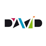
Love it. Great colors. Not sure that the dot over the %22I%22 is needed. Especially given that all the other letters are uppercase... Overall - striking work.
The first time onlooker would read it as DAVD if that dot is missing, hharrison. The I is incorporated along with that D and that can be possible only with that dot. Great concept!
Yeah, the image would have to be changed a bit if the dot was removed. Not much though. Just would have to move the D over a pinch and add another color in between it and the I. The i being lowercase isn't that big of a deal though. Not many folks would notice it. Just a suggestion. Great work either way...
It took me forever to see the negative space correctly in this. Not a fault of the design, by any means. 25 years looking into bright light has left me near blind, unfortunately. Anyway, that is my excuse for not seeing what is obviously brilliant. Still, even when I could not see the negative space, I thought the positive color sections still read David pretty clearly. This is definitely unique. And I've only said that once before.
Light tables (mostly) and computer screens. Light tables aren't used as much in graphic design as they were, but computer screens are still a big bright light you have to stare into in order to work. Back lighting helps. Don't be like me and wait too long. Use lights behind you to offset the brightness of the computer screen. It will help save your eye site.
Staring at fine little amberlyth cuts (or ruby if you preferred) was even tougher. Not to mention the fine coating of spray mount that covered your eyes on a daily basis.
Yup, exactly. Spent years cutting CMYK by hand for screen press. I preferred rubylyth. Along with a lot of trace illustration. Later on we switched to computer. Too late for my eyes. CMYK separations and illustration using a mouse caused my right hand to go bad. I've been a left handed mouse user ever since. Makes it hard for righties to borrow your computer. %3B) Oh, we had a spray mount shrine to bugs. A huge bug got caught once. We never did figure out what it was. People with hairy arms suffered the most from spray mount. We held up a piece of plexy to keep from breathing it and save our eyes at the time. Ever got burned from the hot wax for newspaper mounting?


Lets Discuss
I read it easily at a glance. Very interesting and unique.
Replydido
ReplyMe four
Replywell done!
Replywhat they said. nice work.
ReplyInteresting for sure. The dot over the 'i' could scale up slightly. Nice job though.
ReplyCertainly original (to me anyway) which is fantastic. Floated.
ReplySuper! made me think of brand union for a moment, but this one is so much better!
ReplyI'm definitely missing something here.
Replythis is verry nice
Replyawesome, lisibility still intact. /grats at david
Replylove it!!
Replythanks you very much for the comments!
ReplyLovin' the depth and angles.
ReplyLove it. Great colors. Not sure that the dot over the %22I%22 is needed. Especially given that all the other letters are uppercase... Overall - striking work.
ReplyThe first time onlooker would read it as DAVD if that dot is missing, hharrison. The I is incorporated along with that D and that can be possible only with that dot. Great concept!
Replyabsolutely like it !
ReplyYeah, the image would have to be changed a bit if the dot was removed. Not much though. Just would have to move the D over a pinch and add another color in between it and the I. The i being lowercase isn't that big of a deal though. Not many folks would notice it. Just a suggestion. Great work either way...
Replyits one of the best logos i%60ve ever seen....GREAT JOB!!!!
ReplyIt took me forever to see the negative space correctly in this. Not a fault of the design, by any means. 25 years looking into bright light has left me near blind, unfortunately. Anyway, that is my excuse for not seeing what is obviously brilliant. Still, even when I could not see the negative space, I thought the positive color sections still read David pretty clearly. This is definitely unique. And I've only said that once before.
ReplyNear blind? Wow, so can you see logo's?
ReplyLight tables (mostly) and computer screens. Light tables aren't used as much in graphic design as they were, but computer screens are still a big bright light you have to stare into in order to work. Back lighting helps. Don't be like me and wait too long. Use lights behind you to offset the brightness of the computer screen. It will help save your eye site.
ReplyStaring at fine little amberlyth cuts (or ruby if you preferred) was even tougher. Not to mention the fine coating of spray mount that covered your eyes on a daily basis.
ReplyYup, exactly. Spent years cutting CMYK by hand for screen press. I preferred rubylyth. Along with a lot of trace illustration. Later on we switched to computer. Too late for my eyes. CMYK separations and illustration using a mouse caused my right hand to go bad. I've been a left handed mouse user ever since. Makes it hard for righties to borrow your computer. %3B) Oh, we had a spray mount shrine to bugs. A huge bug got caught once. We never did figure out what it was. People with hairy arms suffered the most from spray mount. We held up a piece of plexy to keep from breathing it and save our eyes at the time. Ever got burned from the hot wax for newspaper mounting?
ReplyPlease login/signup to make a comment, registration is easy