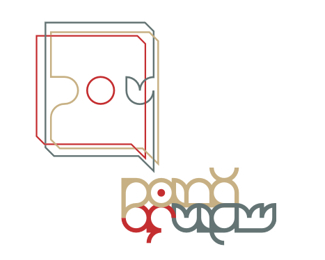
mate - this is a hot mark! Great type and execution.**just a few personal thoughts though.**1. at first i thought it was a ferret with wings. maybe make more of a dip at the back of the neck? I think phoenix's usually have more of a defined head.**2. The gap between the X and the tail seems slightly too big for me.**3. The tail section to the right of the X could be a little more rounded. it seems a little to square and doesnt flow naturally around.


Lets Discuss
very good!
Replymate - this is a hot mark! Great type and execution.**just a few personal thoughts though.**1. at first i thought it was a ferret with wings. maybe make more of a dip at the back of the neck? I think phoenix's usually have more of a defined head.**2. The gap between the X and the tail seems slightly too big for me.**3. The tail section to the right of the X could be a little more rounded. it seems a little to square and doesnt flow naturally around.
Reply@cobatcow.: Thanks for comment mate. They r very useful..i will think about it
ReplyVery nice, liquor.
ReplyI like the type, the birds feathers could be simplified but its a wonderful mark.
ReplyI agree with sisudesigns about the feathers, it was my first thought too. The type and the mark are very well balanced, looking very nice!
Replynice without dot
ReplyI love it and I agree with cobatcow comment.
ReplyLogo is great! Personally, I would make it with other typography...
ReplyLove it. Ver refreshing use of type and mark. Thanks for the break from ordinary. FO SHO!!!
ReplyLove this palate. Great mark
Replyooo...this is good. Enjoying it!
ReplyLike it, how can I contact you ?
ReplyPlease login/signup to make a comment, registration is easy