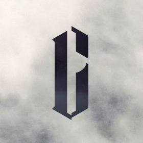
aoeq
by crislabno • Uploaded: Jun. 19 '08 - Gallerized: Jun. '08

Float
(Floaters:
25 )
Description:
aoeq prints
As seen on:
aoeq
Status:
Nothing set
Viewed:
9346
Share:


Lets Discuss
i really like the mark! brilliant.. something about the type seems off though...?
ReplyThe mark is fantastic. You might have some printing issues, but it is a smart design. Regarding the type, I feel it needs to be more linear and squared off. The rounded style doesn't work well with the mark. In addition, there will be quite a bit of people who will not read the 'q' as a 'q'. With a few revisions, this will be that much better. :-)
Reply@Ocularink: thanks bro , will surely do what you meantioned. thanks for your time !*@nido: yes indeed. typo doesn't represent this mark well*@nima.jazireh: thanks :)
ReplyVery good!. The thing with the %22q%22, for me, is that it looks like a capital letter while the rest of the letters are not. I like the type though and I found it readable. Maybe the %22a%22 in the mark should be the same %22a%22 as in the logotype.
Replythe 3D layering is brilliant
ReplyVery attractive and professional, agree with yorch though plus the Q looks like an O...
Replyits cool
Replyoutstanding.
ReplyHello old friend. :)**You've improved quite a bit since leaving DA behind.**Looks like you've been looking more at the pro stuff - DA doesn't look so great anymore now, does it? %3B)
ReplyPlease login/signup to make a comment, registration is easy