Barry Gainford Eyecare
by LloydCreative • Uploaded: Jun. 13 '08
Description:
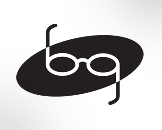
Logo for optometrist designed some12 years or so ago. Still getting positive feedback on this one.
Status:
Nothing set
Viewed:
7902
Share:


Lets Discuss
Thanks for the comments - I know what you're saying about the oval Smartinup, but what can I say? Oval enclosures were big a decade ago, and I wanted to show this logo the way it was created rather than present an altered version. I guess it could have been worse - I could have used the emboss filter with a swoosh and gradient fill!
Reply%22I could have used the emboss filter with a swoosh and gradient fill!%22**Man, this would be a winner if you had. :-P
ReplyI think this one is for sure great (even better if it was done over a 12 years period)
ReplyI like so much this logo... It's realy simple but in the same time so clear... Good work.
ReplyVery simple, direct mark. I agree the oval is dated (and I just saw it used with a monkey yesterday), but the idea is timeless.
ReplyPlease login/signup to make a comment, registration is easy