Planet
by LoomyBear • Uploaded: Jun. 10 '08
Description:
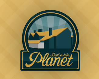
Retro-look logotype for the real estate agency
Status:
Nothing set
Viewed:
4165
Share:



Lets Discuss
Cool. I would kill the white part of the house - it's very distracting and doesn't add anything. I would also kill the oval shape in the background right above the roof line. I'm assuming it's there to lend a curved/3D effect to the logo but it's not working the way you've intended it to - instead it just looks like a curve in the sky. The curve down by the word Planet looks great though and is achieving the effect you're looking for.**One final suggestion, I would brighten up your colors. Retro or not, they're very somber for the real estate market. Most realtors use bright cheerful colors for a reason - buying a house should be a happy experience.
ReplyOh! Got it... Thank you!!! You right about the upper pseudo 3d effect... where my eyes was???!!! %25(
Replylindo!
ReplyPlease login/signup to make a comment, registration is easy