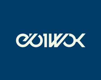
Ebiwok
by 3000HitComboAttack • Uploaded: May. 28 '08

Float
(Floaters:
1 )
Description:
Logo for Ebiwok, ment to be simple and modern.
Status:
Nothing set
Viewed:
1212
Share:
Lets Discuss
This is one of my favorites. It looks cool, simple and modern. the colors are nice too, But the W looks like a M to me.
Reply...Which would make it a W. I mean the points look like the legs of a M to me.
ReplyPlease login/signup to make a comment, registration is easy