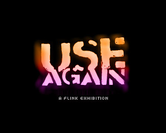
4'33 final version
by misterjones • Uploaded: May. 18 '08 - Gallerized: May. '08

Float
(Floaters:
24 )
Description:
Singapore based event and artists management, specialized in contemporary experimental culture.
This is the final approved version
Status:
Client work
Viewed:
7558
Share:

Lets Discuss
It took me a while to read it and now that I can - it's brilliant!
Replyyeah.. brilliant!
Replythanks. once you see it, you can't not see it anymore..
ReplyWhile I think this is interesting I'm sorry to say that my eyes have a hard time focusing on the numbers even after I got it.
Replynice work dude - very very nice
ReplyExcellent concept, mister jones. My only nit-picky comment is that the '4' within the icon seems a tad bit too heavy in comparison to the '3s'. Even so, nice.
ReplyI'm really not a big fan of this one, the pink against the black just makes it all a bit blurry IMO. I preferred your earlier concepts.
ReplyI'm with art. I saw it, but I still have a hard time seeing it when I look back.
ReplyFantastic work, the best of the bunch, is it harder to see the numbers if its on white?
Replyi love it. I just had to blur my eyes. maybe add a one pink column to the left side of the %224%22 so it pops out more? I like it though
Replybeauty. such a great concept for the culture of the client.
Replyjust posted the final version, got rid of the inch mark.
ReplyNice edits, dude. This flows much better in my opinion. Great job!
ReplyPlease login/signup to make a comment, registration is easy