wilkenson arts
by HelloUriah • Uploaded: May. 11 '08 - Gallerized: May. '08
Description:
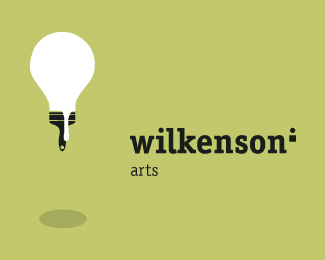
Divided the program into two, manageable sectors, under the one brand of wilkenson.
Status:
Nothing set
Viewed:
8172
Share:



Lets Discuss
I like very much how the brand fits into the light bulb theme. One thing though: i dont know about the paint drip over the brush. If i didn't know it was %22wilkenson arts,%22 it would take me a while to figure out that it was a paintbrush.
ReplyA very creative idea, but as thesergie said, the paint drip is confusing, I think if it is shorter it would be better, other than that ... the logo is PERFECT
ReplyA creative idea. Congrats!
ReplyI saw the brush before the word 'arts' - brilliant!
Replyexcelente!!! buena idea :)
Replygood work, i saw the paintbrush first too. i'd remove the shadow though at the bottom. i dont think it's necessary, nor does it fit the shape of the bulb/brush.
Replyshadow adds a bit of perspective to the design, for me... :) very nice... can i borrow ya brain for 5 mins... gotta do sumthin quick... :)
ReplyPlease login/signup to make a comment, registration is easy