Safari Outfitters - round 2
by kellyoneill • Uploaded: May. 06 '08
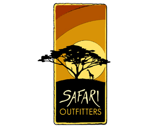
Description:
This is the 2nd comp for this company. I welcome your thoughts!
As seen on:
www.theartistoflife.com
Status:
Nothing set
Viewed:
5867
Share:


Lets Discuss
Much better. However, I feel the slight brush marks you've used on the shapes are uncessary and will get lost at smaller dimensions. Cheers
Replyhey kelly, if you are planning to keep the strokes, you can make just the edge alone thicker and get rid of the yellowish border. Not really sure how the strokes would translate when made thicker inside as well. Anyway, its a lot better now:)
ReplyThanks both of you! I will try a few things... I did not have strokes on the shapes at first and it just didn't flow well, but I see your point about losing them at smaller dimensions.
ReplyThis is your best yet, Kelly. Glad to see you are enjoying Logopond and are so eager to learn. Nice job.
ReplyYes, quite nice compostion and scale. Typography is a little cheese for me but not terrible. I might be responding more to the sans serif rather than the script. Keep up the good work.
ReplyThanks guys! Encouraging for sure...
ReplyI like the feel of this...
Replyvery peaceful. the sunset colors you used are just the right thing.. *
ReplyI like the colors very much. The type can be modified to make this a great logo. Nice work!
ReplyNice logo with nice colours.*I think the word Safari really swings, but typographically spoken the word 'outfitters' underneath really need some more work, because your design is as strong as its weakest part.
ReplySaawan and cresk - thanks! What kind of font would you suggest for %22outfitters?%22 I don't want it to compete with %22safari%22 so I went with a safe san-serif. I appreciate your comments.
ReplyWow, distinctive style. Nice graphics, has an almost 'tactile' feel to it. Beautiful work.
ReplyGreat job! This is quite easily the best logo in your showcase.
ReplyPlease login/signup to make a comment, registration is easy