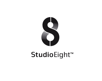
Studio 8
by actiondesigner • Uploaded: May. 05 '08 - Gallerized: May. '08

Float
(Floaters:
27 )
Description:
Production Company in norway. Incorporating S and 8. In progress.
Status:
Client work
Viewed:
8617
Share:
Lets Discuss
This is a very clever concept. The bottom type is a bit bland ad 1980s for my taste but I like the icon. Nice work.
ReplyThere you are again%3B) The type is still open for debate
ReplyI like all of these. Nice work.
ReplyI agree, some nice solutions here.
ReplyThis is my fave of your solutions. I even like the retro typo. It's a little roller disco but...it stands out IMO.
Replytype reminds me of Herb Lubalin's work.
ReplyVery Nice. I can't stop looking at it.
Replyactiondesigner! perfect name for you - love your work
ReplyEight is Enough! Didn't that show used similar type?%0D*%0D*Lovely mark tho!
Reply@ahab and firebrand*thanks a lot. **@gthobbs*I think I agree with you. A bit back and forth in the type. Give it some more thought%3B)**@tconrad*Not sure what you mean. Yes ...I love Lubalins work a lot. The typeface is Bookman Swash is designed by Ed Benguiat, but Lubalin did a lot of swooshi typetreatments
Reply@matador*nice to hear:)**@raja*That means more than you think%3B) Its time to get the actiondesigner out in the shelves. Thanks for liking my work. You have a pretty solid showcase yourself:)**@chanpion*did some googling and youtubing. The reason for the typeface is more based on the marks shape and of course that I like the look of it. I have tried a more contemporary font ...and that works pretty well aslo.**Glad you liked the mark:)
ReplyI like the type. It works well. Nice job, action.
ReplyLike! Nice job.
ReplyI like the typeface to, it adds personality to the already great %22S8%22symbol. Good work!
ReplyThis is my favorite of the bunch as well. Good vibe!
ReplyPlease login/signup to make a comment, registration is easy