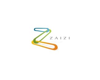
CryptoLink
by Chanpion • Uploaded: Apr. 22 '08 - Gallerized: Apr. '08

Float
(Floaters:
45 )
Description:
Proposed design for a internet communications product providing absolute secure (cryptographic) connection between two points.
Status:
Nothing set
Viewed:
14833
Share:


Lets Discuss
C(hampions) L(eague)... ?.. wishfull thinking mate %3B)
ReplyIt is very clean. nice work!
ReplyYeah, I'm liking it :)
ReplyCool. Reminds me of that game, Solitaire. Up the Reds!
Replyi like
Replydig it.
ReplyThanks for the comments all. and damn you nido %3B%5E(
Replygo Man U.!!!
ReplyAre you interested in doing a logo for me. info@awnstudio.com
ReplyThanks everyone. Mr Conrad how dare you post pro ManU comments on here! (just joshing mate, pity about the draw tho %3B%5E)) but we all know that the Liverbird is gonna fly away with the trophy right.%0D*%0D*I will email you shortly Mr Awn. Thanks for your interest.
ReplyRipoff... http://www.dotserving.com/
ReplyIn Chan's defense... there are literally hundreds on logolounge for example of this style. Not saying anything against you Chan.
Reply630 On logolounge to be exact. :)
ReplyThats ok guys. I'm sure Benjamin here didn't mean any harm, and the rest of you are right. I've also used this dot style on several of my other logos. But more importantly to me, the concept behind it is what carries it off. Its the encryption and decryption factor that I was trying to convey and the shape of the cross being a safe/no-harm incon.%0D*%0D*Nevertheless, if Benjamin here had said the 'R' word in my face, I still would've clipped him over the head %3B%5E)
ReplyWhat up, Chan-da. I didn't even notice the cross reference. Boy, am I slow. Nice one, dude.
ReplyForgive me for the R-word, perhaps that was too harsh.**Don't get me wrong%3B yours IS better, especially with the C and L hidden inside... but the similarities are too many too pass up... the colours, the linking... down to the number of dots and a similar enough choice of font.
ReplyYes there are many of this style out there in the www... but this concept fits the product very well! Besides that I especially like how you put the safety aspect into this, another gr8 work!
ReplySweet mark!
ReplyPlease login/signup to make a comment, registration is easy