dog in britain identity
by andrendhiq • Uploaded: Apr. 21 '08 - Gallerized: Apr. '08
Description:
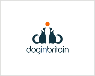
Logo proposal for a dog community website. unused. concept: d+i+b letters combination, people care in dog.
Status:
Nothing set
Viewed:
8030
Share:

Lets Discuss
I like this logo. The the only thing I might change would be how dark the word %22in%22 is. Good job!
ReplyYes I agree wit evoltix about the orange, I like this too!
ReplyVery clever use of negative space. I personally wouldn't change 'in' to orange but maybe make it more tinted for contrast. Great job though overall.
ReplySorry andrendhiq! The dogs look more like meerkats to me! I also think the tails are too fluffy (they look more like cats tails) and the nose of the dogs look a bit off. Also the ears don't look right, IMO. I do like the use of negative space, but I think you've missed the mark with this. Nice font though!
ReplyThat's a really unfortunate name. All I can see is 'dogging britain'.
ReplyOMG - LMAO. Are you actually in the UK ?**Have you not heard about Dogging ?**Google %22dogging britain%22**it is a good logo, but...
ReplyThey look more like badgers or raccoons, or a hybrid of both, rather than dogs. I thought wolves howled at the moon, i mean i know some dogs do, but aren't we all more familiar with the silhouette of the wolf and moon? whats the significance of the orange dot? I do like the type and agree i'd make your in stand out with your accent colour.
Replyandre, yeah i didn't see dogs either, more like lemurs or as someone else said meerkats. and maybe it's just the color difference in the words, but i feel claustrophobic when i look at the type. i like the hidden i though.
ReplyNice work I think it balances perfectly - jumped out against the others which is high praise on this site - well done. What is the font by the way ?
ReplyAs already said: the dogs are NOT looking like dogs...
ReplyI really like the way the white space creates a person with his hands on the dogs heads, very nice… it’s a little unfortunate with the 'doggin britain' reference %26 the fact that, as already stated, they don’t look too much like dogs… but a great idea nonetheless.
ReplyIt's a nice concept - but in the small size of the thumbnail I saw two strange looking mice rather than dogs.
ReplySmart.
ReplyHe he really thanks for feedback and suugestions.Yes, i realize this logo need more works.Unfortunately this concept rejected early by brand owner so i don't continue any more.Hope i have time to do again.%0D*%0D*about %22unfortunate name%22. I don't care about that.:) just ask brand owner by your self.%3B)%7E
ReplyAndrendhiq - what is the font you have used on this? would really apprec. thanks
ReplyHi freecloud.Sorry i forgot your first question.The font customzed from VAG rounded.
ReplyI love it.
ReplyPlease login/signup to make a comment, registration is easy