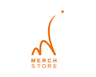
Merchstore
by FUTY • Uploaded: Apr. 20 '08

Float
(Floaters:
8 )
Description:
A rising star... emerging from the masses.
We are soon relaunching the CI of www.merchstore.net
Status:
Nothing set
Viewed:
4729
Share:
Lets Discuss
It reminds me too much of the McDonalds logo. It may be the color that pushes it that direction.
ReplyI'm with tconrad. Imagine this without that last upward swoosh on the 'M' icon. I thought McD's too. This is a great looking logo and the idea is nice too, but there might be a better way to style the icon.
ReplyCheers for commenting and yes, I understand what you mean.. still, I find it to be individual. *It might be just hard because Mc%B4Donalds is so huge, to use a dynamic %22M%22 that way. I wanted to use the swing as simple as possible, that way it came out just like this. **Customer likes it loads %3B )
ReplyI dig this.*
ReplyPlease login/signup to make a comment, registration is easy