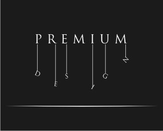
There's something really nice about this logotype. The U's are slightly awkward, but I get what you are going for there. All in all, nice logotype. It's very memorable.
I like what you are going for with the horned %22U%22s, but I think that maybe only the first one should be horned. I think this would help with legibility, and it's kind of overkill to have both %22U%22s stylized in this manner. Overall a very effective, stylish design. Well done.
I have to disagree, steverin0. I think it is necessary to have both u's stylized otherwise it'll look imbalanced. That said, I'd try simplifying the u's so they have less of the wavy (inverted R) lines with slightly straighter lines as the actual astrological sign.*


Lets Discuss
There's something really nice about this logotype. The U's are slightly awkward, but I get what you are going for there. All in all, nice logotype. It's very memorable.
Replygreat!! :D i'm taurus so i'll fav this! :D
ReplyVery interesting.
Replyawesome%7E!
Replyvery good work, mate!
Replyi like it...like ocular said, memorable.
ReplyI like what you are going for with the horned %22U%22s, but I think that maybe only the first one should be horned. I think this would help with legibility, and it's kind of overkill to have both %22U%22s stylized in this manner. Overall a very effective, stylish design. Well done.
ReplyI have to disagree, steverin0. I think it is necessary to have both u's stylized otherwise it'll look imbalanced. That said, I'd try simplifying the u's so they have less of the wavy (inverted R) lines with slightly straighter lines as the actual astrological sign.*
ReplyThis is good as a thumbnail, but great at the larger size. But that is sometimes the issue when doing font driven logos, eh? It goes in my faves.
ReplyIt looks like the u's are reflecting on water to me...nice effect
ReplyPlease login/signup to make a comment, registration is easy