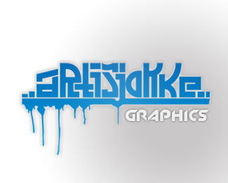
Amuzed
by art=jokke • Uploaded: Apr. 06 '08

Float
(Floaters:
4 )
Description:
This logo is made for a Entertainment company. The "breaking loose" color-effect means the freedom and happiness of entertaining people.
Status:
Nothing set
Viewed:
4957
Share:
Lets Discuss
This is cool! like it. Maybe could use some simplifying but very eyecatching.
ReplyI like the color and movement. I agree with artboy, the top part could be simplified a tiny bit. Maybe pathfinder them so there's not that many overlapping pieces? I like the colors though. Last, a slightly more dominant blue on the bottom. It seems ever-so-slightly top-heavy.
ReplyOh... maybe it seems top heavy because the gradient is darker on top. Maybe you could try reversing it.
ReplyAwesome. My only nitpick is that the logo is spelt with a 'Z' and an 'S' in your title :)
ReplyNot bad. Although you did just use the graphic from the 'Vecteezy site'. So not exactly original.**http://www.vecteezy.com/vf/414-Vector-Study
ReplyPlease login/signup to make a comment, registration is easy