Williamson Pottery
by HayesImage • Uploaded: Mar. 26 '08 - Gallerized: Mar. '08
Description:
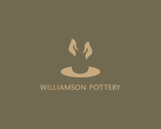
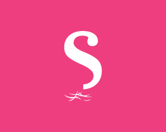
Design for a local Potterer.
Status:
Client work
Viewed:
24101
Share:


Lets Discuss
Superb! Love your work with negative space! Beautiful!
ReplyThumbs up, Hayes!
ReplyYes, lovely use of neg space. Hayes, you are coming up with some cracking work lately.
Replythis is excellent!.. magic!.. like a rabbit being pulled out of a hat %3B)
ReplyWow...Thanks Guys!! :)
ReplyVery strong work Hayes. Love it.
ReplyLove it Hayes, great work!!! n_n
ReplyBravo!!!
ReplyBest use of negative space I have seen in a long, long time.
ReplyThanks guys!! :)
ReplyGood work..
ReplyThis is amazing, well done!
ReplyCheers :)
ReplySuperb. At first my stupid brain saw two gorillas racing to the the top of an island but when the hands and pot popped out at me it was like a slap in the face from Patrick Swayze. Really like it matey.
Replyhahaha Gareth, that comment just made my day...Cheers mate :)
ReplyMay I be the first to say that I don't like this.... and then take it right back cos I think its EXCELLENT! %3B) Just wanted to cause a minor stir for a millisecond. Great work!
ReplyI think it sucks. %3B-P
Reply@ gareth : Dude, I totally see it.**Yea, Hayes, this one certainly is expressive.
Replyhahaha...thanks guys... :D
Replywow just love it! very creative.
ReplyNice!
ReplyVery clever dude.
ReplyThanks :)
ReplyAre they Demi's or Patrick's hands?**Seriously though, this is a beautiful logo Hayes. You are on a roll!
ReplyThe design is obviously clever, u cud have worked on the hands to create a font play for WP. Jus a thought, no offence
Replyhehehe...Now all we need are the 'Righteous Brothers' :)**Thanks guys!!
ReplyMade Logo of the day...today :)**http://www.logofromdreams.com/
Reply1 of the 3 designs selected for Logolounge 5 :)
ReplyAll good choices, well done Hayes!
ReplyCongrats!*
ReplyCheers Roy %26 Alen :)
ReplyCheers!!
Replyvery neat. very clever. very good.
ReplyThanks Tomme :)
Replydefinitely smart one! congrats!
Replynothing short of...*WOW!
ReplyCheers guys :D
ReplyThis is all class, really nice logo mate
Replyjackpot!
ReplyCheers Cerise %26 Raj :D
ReplyHi, Hayes Image. I love this one.
ReplyVery clever use of negative space, so simple yet so effective.
ReplyThanks Milou!! It's one of my favorites :D
ReplyThanks Alen :D
ReplyDid I see this one in LogoNest? I love the use of negative space.. great concept!
ReplyYou did :D With a white background of course. Thanks!!
Replynice one...I love this :) I can feel the texture of the pottery....damn good!
ReplyGood to hear :)
Replymmmm beauty !
ReplyThanks Julius :)
Replylooks magic
ReplyLol!! Thanks bud :)
Replyi dont understand. what is depicted on the logo?
ReplyHands molding clay on a spin table. The clay is implied in the negative space.
ReplyClearly you've never seen Ghost with Patrick Swayze.
Replyis not that a rabbit from Alice in Wonderland? hands not hands
Reply@cnasshan - Thanks for the support :)
Reply@sirvsemmir - Does this help? - http://us.123rf.com/400wm/400/400/frogtravel/frogtravel1209/frogtravel120900025/15236600-potter-hands-making-in-clay-on-pottery-wheel.jpg
amazing
ReplyOne more for the ton!
Reply@bkdesign Thanks :)
Reply@Roy;
http://blogs.abc.net.au/grandstand/images/2008/05/31/clarke_century_helmet_2.jpg
^ Ha!
ReplyNicely done. You're so great with negative space.
ReplyThank you :)
ReplyGreat work here
ReplyThanks man!!! :)
ReplyI must thank you for the efforts. Great work here
Replyhttp://freegiftcardgenrator.com and http://onlinefreegiftcodesgenerator.com and http://onlinefreegiftcardgenerator.com
Thank you a bunch for sharing this with all people you actually know what you are talking approximately! https://www.wrgappliancerepair.com
ReplyPlease login/signup to make a comment, registration is easy