XBG
by DeanMaschine • Uploaded: Mar. 19 '08

Float
(Floaters:
2 )
Description:
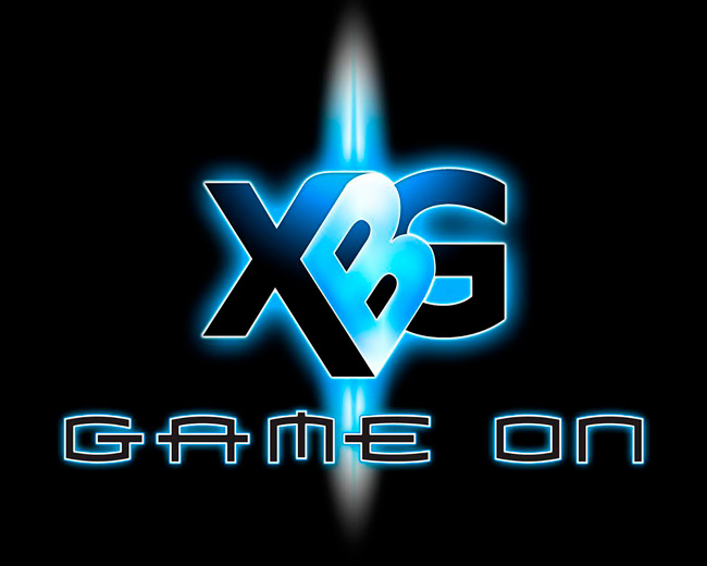
This logo is for an annual, army-sponsored, video game tournament called XBG(X-Box Games). The type-face of the tag line(game on) is the Xbox typeface...requested by the client
Status:
Unused proposal
Viewed:
3,561
Tags:
Game on
•
Games
•
X-box
•
XBG
Share:

Lets Discuss
the mark looks great, maybe add a gradient border around game on?
ReplyI was noticing that the green parts of the B make the G look like it pointed at the X. A tiny bit of tweaking would make it real. Also, the gradient should be switched on the G so the darker green in the inside of the B instead. Should give it a touch more dimension. Really cool logo! Well put together and balanced!
ReplyPlease login/signup to make a comment, registration is easy