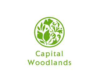
I agree with both comments above, the W and the S are taking away from the beautiful illustration you created. Keep the type simple, don't over design.**If you want to incorporate the type more, maybe try starting the illustration of the leaves at the C of Capital and have it swirl around the W to the bottom of Woodlands, so that the illustration encompasses the type making it a little less conventional.**Great mark!
Completely agree with everyone above. Much better mark than the previous version. Just don't go overboard with the type. Clean and simple is much better. I'd just go all gray text but make sure both lines of text are the same size, as currently they are not.
Agree with above on the type. Beautiful mark, though!**The only other thing I thought of ... I'm not sure what this is for (not sure what green charity means) but if by 'charity' you need to cut costs, you could probably pick one dark green that tints nicely and get away with one color to save costs on printing, etc.


Lets Discuss
Love the mark. Not crazy about the size or green of the WS
ReplyI agree with gthobbs. I would suggest using all grey, or green for the text. Very nice logo!
ReplyI agree with both comments above, the W and the S are taking away from the beautiful illustration you created. Keep the type simple, don't over design.**If you want to incorporate the type more, maybe try starting the illustration of the leaves at the C of Capital and have it swirl around the W to the bottom of Woodlands, so that the illustration encompasses the type making it a little less conventional.**Great mark!
ReplyWoah. That's beautiful. I also agree that the W and S are a bit much though.
ReplyReally nice work
ReplyCompletely agree with everyone above. Much better mark than the previous version. Just don't go overboard with the type. Clean and simple is much better. I'd just go all gray text but make sure both lines of text are the same size, as currently they are not.
ReplyWow, is that really you dache? must be having a bad day %3B%5E)**Can't wait to see more of your work Super Hiro!
ReplyPlease remember that off topic comments can and will be deleted.
ReplyOh really! Damn! Thats gonna change my life forever. I'll remember that next time Mr Dache! Thanks for the heads up mate.
ReplyChan da man, I believe we've all gotten passed this. Your comment seems out of place. :-/ No offense dude.
ReplyHave we? Only time will tell mate. And no offense taken Kev.
ReplyThe logo looks nice. But, the green color in the type isn't that good.
ReplyAgree with above on the type. Beautiful mark, though!**The only other thing I thought of ... I'm not sure what this is for (not sure what green charity means) but if by 'charity' you need to cut costs, you could probably pick one dark green that tints nicely and get away with one color to save costs on printing, etc.
Reply@ Chan : Cheers, mate!! It's about time we all share this passion together. :-D
ReplyWhat a beautiful mark. Sorry to be so harsh but type (treatment and choice) is not at same level IMHO...
ReplyPlease login/signup to make a comment, registration is easy