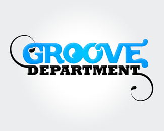
Foodies
by Germen • Uploaded: Mar. 05 '08

Float
(Floaters:
2 )
Description:
This is for a company something like a restaurant, i don't know the english translation for that. The orange thing is a cook bonnet. But i'm not sure if it's recognizeble. I hope you can give me some feedback on this..
thanks
Status:
Nothing set
Viewed:
5414
Share:
Lets Discuss
Neat idea. I saw the bonnet, but it feels awkward. I would make the whole logo white (or whatever solid color) and add a gap between where the d's circle connects with the d's ascender.*I also think that the e looks too stylized. Try to simplify it. My eye seems to go there too much.
Replythnx for your comment. When you were typing it was just transforming the the %22d%22 in to this. The bonet is much beter recognizable i think, but the d is now i little bit harder to read. But i think it's ok..
ReplyPlease login/signup to make a comment, registration is easy