Unblock
by squarelogo • Uploaded: Feb. 28 '08

Float
(Floaters:
24 )
Description:
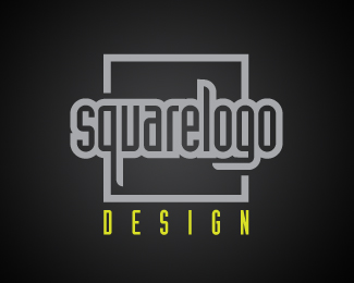
Proposed logo for proxy web site that allows users to surf sites that are blocked by a firewall.
Status:
Nothing set
Viewed:
5085
Share:


Lets Discuss
I immediately thought %22access to something blocked%22 so you are spot on there.
ReplyInteresting.
ReplyOutstanding simplicity.
ReplyThank you all for your comments!
Replyhey square......%0D*%0D*Simply amazing..... great concept.... you must submitt this for Logopond awards
ReplyI'd consider making the door bigger...maybe 75%25 of the circles diameter. I imagine the door would be hard to read when the logos size is reduced. Great job otherwise!
Reply%5E%5E%5E%5E%5EYup.**Great concept. Just needs some refinement on the execution.
ReplyHi squarelogo,%0D*%0D*I liked something about this from the moment I saw it!! Though mentally I was a little blocked over the 4-color requirement to bring out the depth. But I've come to terms with that. :)%0D*%0D*Doorknob has to go, if you ask me... it's a small and distracting mole that is not necessary to convey the idea of %22door%22. I also think you just slightly missed an alignment point that resulted in an unnecessary fragment of white to the left of the door. I'd drop the shadow because it strikes me as distracting--especially if you scale this and/or pair it with type.%0D*%0D*The result works better for me:%0D*%0D*%3Ca href%3D%22http://metaeducation.com/logopond/unblock_2.png%22%3Eunblock_2.png%3C/a%3E%0D*%0D*Regards,%0D*met%26aelig%3Bducation
Replythis is fantastic!
ReplyThanks everyone! Great comments and suggestions.
ReplyOne more thing...*It may look a little better if you make the door the same depth as the depth of the rest of the logo.
Replyvery nice job! congrats!
Replyeta, I've said it before and I'll say it again...I find your need to take someone's work and edit it yourself offensive to my sensibilities as a Creative Director. I've seen you do this with this post and a number of others. It's particularly odd that your name itself has the word education in it. A balanced educator knows that %22giving guidance%22 is far better than %22doing%22 for someone. And personally, I would not be comfortable with someone's unsolicited hands-on participation in my client's brand. It's an arrogant gesture IMO. But of course that's just my %22unsolicited%22 opinion.
Reply@gthobbs:**We can discuss methodology of critique personally in email if you wish. As for *me*, I find it offensive when people would criticize someone's work without actually caring enough to try it out to see if their advice holds water.**Graphic design is a visual medium and the best way to exchange visual ideas is through pictures%26mdash%3Bnot words. I like this logo and I like being able to show (rather than speculate) what I think could make it better. But I will gladly refrain from commenting on anything you draw. Other recipients may take my advice or disregard it entirely if they wish.**Regards,*met%26aelig%3Bducation
ReplyI just hope you don't have a staff of designers working under you. In my 18 years of experience (both as a designer working for someone and now as a Creative Director over a team of 40) I've seen it can be demoralizing when critique comes in the form of %22here, let me do it for you%22. As often as I may be tempted to do it, I refrain because IMO it can undermine the exploratory process and sense of ownership for my designers. If someone asks me to take a stab, that's a totally different matter.**Perhaps this would be a good Forum topic. I'd love to hear professional comments.
ReplyGlad you brought this up, gthobbs.**It's also important to take notice of the gray flag. Squarelogo isn't actively looking for any feedback. If your thoughts can't be expressed into words or if the designer personally requests a visual mock up, that's a different story. Another approach would be to email the designer instead of undermining the designer's creative intelligence on a public site.**Just my two cents.
ReplyI think when it comes down to it, we're all designers and even if we see a grey flag we can't help but comment on something that pops into our head.
Reply@ spiffy: correct, it's like trying to hold back the tide getting the likes of us not to express an opinion. And that's why we're here. I'm specifically talking about taking another designer's post...manipulating it...then attaching your own tweaks to ther logo to your comments.
ReplyI would have to agree with gthobbs. IMO, I find metaeducation's practice of editing the designer's work and posting it for review particularly offensive and degrading. Especially when it was never asked for by the designer.*If you've ever worked for someone like that in a creative department capacity, you can certainly relate. The method only angers and demoralizes.
Reply@squarelogo: I apologize that the meta-conversation is taking place in the comments section of your logo.**@others: If you wish to discuss whether critique to the level of detail of images, or too many specifics, offends you or not... please move it to this forum thread:**http://logopond.com/forum/viewtopic.php?pid%3D9750
ReplyPersonally, like metaeducation, I sometimes take a person's design and see if my suggestions will hold water. This way I am confident that any suggestion of mine is at least viable. BUT, I never post any manipulation I may have done back to the original designer and I delete it immediately once my curiosity has been assuaged. I agree with everyone else that posting it back to the designer is stepping on toes for sure. I'm going to check out and see if the view topic is still going. Oh, as for the design itself, great job!
ReplyThis is unique, great concept and delivery.
Replygreat concept and execution here.
Reply%5EAgreed with andreiu. Fantastic work.
ReplyPlease login/signup to make a comment, registration is easy