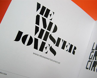
Nice. Very retro feel. Certainly pushed the limits of legibility without sacrificing it. One point of contention for me is the angle of the %22N%22 in %22AND%22 but might not be anything to do with that and have it still read.
I'm a huge fan. The throwback style here makes me shiver (in a good way). It was perfect until I read gthobb's comment, and now the angle in the N in AND is bothering me, too but not enough to quell my obsession!
Thanks for the nice comments. I'm not bothered by the N in AND, it sort of points to the start of the invisible diagonal line, and i didn't want it to run parallel with that line.


Lets Discuss
Nice. Very retro feel. Certainly pushed the limits of legibility without sacrificing it. One point of contention for me is the angle of the %22N%22 in %22AND%22 but might not be anything to do with that and have it still read.
ReplyU're great!*lovely works!*Respect
ReplyYour eye for typography blows me away. Nice work!!
ReplyOf your personal logos, this one is my favourite.
ReplyI'm a huge fan. The throwback style here makes me shiver (in a good way). It was perfect until I read gthobb's comment, and now the angle in the N in AND is bothering me, too but not enough to quell my obsession!
ReplyThanks for the nice comments. I'm not bothered by the N in AND, it sort of points to the start of the invisible diagonal line, and i didn't want it to run parallel with that line.
Replyreally nice
Replyreally nice
ReplyJeez, thats awesome.
ReplyThis is thoroughly awesome indeed.
Replygreat execution.
Replylove it
ReplyI really like the way this looks, nice job.
Replythanks Joe, and all the others :)
ReplyI really dig this!
Replyinterested! good job!
ReplyNice to see this in the gallery. Have always loved it.
Replythanks everyone, was a nice surprise to see this one appear on the home page 9 years after uploading it :)
Replyhey, 'any given sunday, stay on the field of play' lol
ReplyPlease login/signup to make a comment, registration is easy