Natuur 2000
by misterjones • Uploaded: Feb. 18 '08 - Gallerized: Feb. '08
Description:
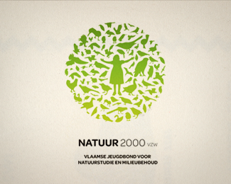
belgian educational youth organisation for preservation or nature.
Status:
Client work
Viewed:
54579
Share:
Lets Discuss
Logo explains it all! Nice
ReplyIt is an excellent work. Maybe some of the figures at the edge of the circle shape could surpass the imaginary line and it could be better, just a thougth. And why the female shape?
ReplyI like it, but one thing is bugging me%3B Is it preservation of nature or preservation of birds?
Replynice concept.%0D*%0D*congratulation
Replyrespect for the idea!*
Replyeducational focus is on birds (lots of field trips with the kids), but preservation of nature is the underlying theme.*thanks for the nice comments
Replyvery nice mark. i like that all the birds are contained within the circle. great job.
ReplyAnd if I am right, not one bird is the same. Well done.
ReplyNice mark. Vector pack or hand illustration?
Replythanks for the comments. The birds are from various sources. Google search scanned some pictures from books, and converted everything (some by hand, some using Live Trace) to paths, eliminating too much detail to keep the final illustration quite light.
ReplyJudging from your portfolio and your website. I must say welcome to the pond. Your work is outstanding and I love your style. So clean.
ReplyThanks for the thumbs up on my work %26 site. appreciated. Must say that there is loads of great work on logopond - a fantastic source of inspiration.*Note that me and my wife work together (she's the %22me%22 in %22me and mister jones). We're currently heading a design company in singapore. Will upload some of her logos too soon.
Replycool Mr Jones!
ReplyThis is a big concept! I am wondering if by changing the color scheme - for example: the girl in pink and the birds in black or grey - it wouldn't have a biggest visual impact?...
ReplyI like it a lot, inspired by Unilever? http://www.unilever.co.uk/ourcompany/aboutunilever/introducing_unilever/ourlogo/
Reply@ drewboy: Please don't bring up the Unilever logo again. The whole silhouette usage trend has been going on for quite a while now, Unilever definitely wasn't one of the first either.**This one is very nicely done and very fitting with it's subject. My only points of critique would be like already mentioned that you only used birds (for as far as I can tell there isn't even a squirrel in there), although the organization is called %22nature study and preservation%22.**Well done Mr %26 Mrs Jones!
Reply@michiel: the point is that it's not a silhouette - it's a collection of silhouettes making a form... I don't know what you mean by 'bringing up' the Unilever logo. I asked if it was an inspiration for this logo.
Reply@michiel, the organisation came with the same feedback. More animals, throw in some bats, rodents etc. Take note that this is a work in progress, i'm doing this pro bono because i know people in the organisation, so they're not rushing me. If i find the time to work on version 2, i'll definetely post it here. Anyway, thought this was a nice folio piece to show here.**@drewboy, i wondered why it took so long before anyone mentioned the unilever logo :)*The concept (amalgam of shapes to form another shape) is obviously not new. Unilever is probably the most famous example, but i can list quite a few other logos like that. **thanks for the nice comments
Replyooooh lovely!
ReplyLove the symbolism of the female figure being the source of nature. In your mind is she mother nature, mother earth??
ReplyJust wondering what you had been looking at to get to this.
Reply@ jordoman, in my mind it was a combination of expressing unconditioned childlike fascination for all things nature yes, the female fertile principle in the middle of the circle: mother - earth.**(ok, i sound like a hippie now :)
ReplyMooi Werk! Kan Design? %3B-)
ReplySince we are going down that unilever road ...here is an interesting article about unilever and likes. You have probably postet this somewhere already.**http://www.underconsideration.com/brandnew/archives/the_united_states_of_animalia.php
Replythanks dooms, i'm working directly with the client on this one. *Geen Kan design, wel bij Flink in Antwerpen tot maart '07, en momenteel in Singapore aan het werk.
Replycorrectie, Flink! Natuurlijk
Reply@ thx, thank for the article. Very interesting, hadn't seen that one before.
ReplyJust! in de burbure straat. Duval Antwerpen hier, veel succes ginder!
ReplyThis logo has nothing to do with the Unilever logo. Discussing about the U. logo as inspiration is a wrong way to go...**...and please, don't tell me something like that: %22Don't you see any connection?...%22
Replywow.... awesome
ReplyReminds me of the Unilever logo.
Replylol!
Reply%22Reminds me of the Unilever logo.%22 - please read the posts from above...
ReplyRespiro - people are free to make their own judgements here. As MisterJones %26 David pointed out earlier, it may be an overused reference, but the fact that people 'expect' it to be cited means that it will be discussed at some point. If you don't think it's relevant, fair enough, but others may have different views.
ReplyEveryone relax for a minute. When i made this logo, i knew people would bring up unilever. Anyone who has made a logo like this (amalgam) will get this comment. Just keep in mind that Wolff Olins (who created the mark) didn't invent this, it's a graphic solution that has been aroud for a while now. **peace
Replyok by me mister jones!
ReplyEk dink dis baie mooi!
Replyexcelente logo
ReplyFabulous! Nicely done!
ReplyI like the look of this...
ReplyWow, this is beautiful! Great work!
ReplyEveryone always brings up the Unilever logo.**Goes to show just how powerful it is really - although as everyone 'else' pointed out... it's not the first, and it definitely isn't going to be the last.
ReplyMr Jones, just checked out your website, your portfolio is sheeet hot! Love the Flink Identity. Nice one! :)
Replycheers Neil,*Just for the record, I have to add that the work on my site is developed by me and the misses. I designed the flink identity but she did all the art direction to get me going. *
Replybeautiful concept!
Replylove this one. Great concept and execution
ReplyAdd one more congrats to the list - nicely done.
Replygreat work !
ReplySay, I've seen this exact use of animal silhouettes before somewhere. I think they made a heart and were for a vet hospital or something. I'm trying to find it. Or maybe I'm thinking of the new US Humane Society logo. I'm not sure. Don't get me wrong, I like this. Not saying anything is a rip.
Reply@ THEArtistT - you're thinking of the Unilever logo. But this isn't the first logo on the Pond to borrow from that style - there's been others.
ReplyNot at all. I am very familiar with the Unilever logo and never thought this one, and others like it, were that similar to it. Unilever's logo is really tight%3B uses images that relate to as many of their products as possible as well as relate to the users of those products%3B and their breadth and placement of the images in such a tight formation is superior to others of this same style.**No, I was thinking of a logo that is animal specific like this one. I may have seen it used in a local sign. Not online at all. But the Humane Society logo is of very similar execution.
Reply@ THEArtistT - You're kidding right? How can you say this isn't stylistically similar to the Unilever logo???? It's a bunch of smaller illustrations arranged to make a bigger one. Or in the case of Unilever, arranged to make a letterform. How is that NOT similar?
ReplyI did not say the style is not similar. The style is not similar. It is the same. I was referring to the execution specifically.
ReplyHey, Unilever is back! :)*I'd like to refer to my comment from Feb. 22 '08...**peace
ReplyTHEArtistT, I think you're refering to the logo that uses animal silhouettes to make a map of the US? Is quite recent, don't know the name..
Replyso beautiful design.
Replywhere's the badger? :))
ReplyNice balance... it could also work for the Hitchock movie %22The Birds%22
Replybeautiful.................... :D
Replylove this one. Great concept and execution. %3Ca href%3D%22http://www.lovepanky.com/%22%3Elove%3C/a%3E it!
ReplyLove it, a lot!
ReplyThanks for a nice share you have given to us with such an large collection of information. *Great work you have done by sharing them to all.
Replyimpressive work...
ReplyJust put it 100! Great work, bud.
ReplyPlease login/signup to make a comment, registration is easy