Twins
by actiondesigner • Uploaded: Feb. 16 '08 - Gallerized: Feb. '08

Float
(Floaters:
96 )
Description:
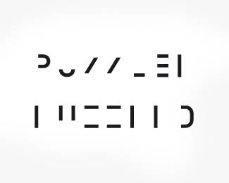
Logo was made for a bold creative team consisting of two people. Two people being brothers ...and fortunately born on the same day. TWINS was a suitable name for the two. To reflect the essence of the duo, a bold typeface was created to reflect the boldness of their approaches. The number 2 was integrated to show the creativeness of their ideas
As seen on:
http://www.twinscomms.com
Status:
Client work
Viewed:
52400
Share:
Lets Discuss
This type works better in my opinion. Nice work.
Replyyes, very clever. i didnt see the previous type...but this works very well.
ReplyIt's ideas like this that I wish I had come up with. :)
Replyvery clever concept. Kudos to you.
ReplyClever! Great find! :)
ReplyVery nice. Good job.
Replya classic
ReplyA winner!
ReplyThank you very much for the kind words.**@ocularink. Agree that this type works better. Much better%3B-)
Replygreat logo! the 2 is one of those 'hidden elements' that everyone will actually get to see.
ReplyExcellent logo.
ReplyNiiiice!
ReplyIm always a fan of clever and simple. **nice one!
ReplyLovely
ReplySimple but VERY clever. i like it!
ReplyIt's perfect, but for me you can try to make in evidence the %22N-2%22, maybe with a different colour
ReplyThanks for all the comments. Very rewarding**@2dispari*I have given that some thought ...making it more evident. Have been experimenting a bit with it. I feel that it looses its edge somewhat by doing so. Not that rewarding. And I feel that most people see it in a short while ...or maybe not!?! It could be an idea if used on a t-shirt or when people need to get it fast. I have some examples. Ill see what to do with them. Thanks:)
ReplyThis one is so good! The 2 for the N is brilliant. Man, you've got a great portfolio.
ReplyThanks for your kind words peterehat. Glad you like my work%3B)
ReplyCongrats on Wolda mate, another great one. :)
ReplyGreat logo for a great designer, cogratulations!
ReplyI mean from %3BD
ReplyThanks guys:) Wolda was very exiting. The three-tier jurying makes me appreciate this even more. The cool thing was that based on the score, I got the 6th best logo overall. On a winning streak this past days. And you can see it all over my face:) hehe
ReplyCongrats, dude.
Reply%0D*Hey Action :D %3E Congrats on the win! :)))
Replythis should have won the grand prize, i love it so much.*
Replysoooooooooooooo cooooooool
ReplyIt's a pleasure to add this to my LogoPond 'favourites'. Superb logo.
Replythis is a classic already. great work!
Replycool design. i like it
ReplyThis action designer is MIA.
ReplyNot MIA yet, just a long deserved summer holiday!
ReplyYes. That's great!
ReplyOh man, it actually took me some time to recognize that the letter %22N%22 can also be read as number 2 if you tilt your head a bit. I think it's awesome!
ReplyThanks griddle. Some see it right away - while others find it rewarding when they see it after a bit. A little bit FedEx about it being a bit hidden - without comparing the two
ReplyThe logo is so readable that melts my brain out, sweet!
ReplyThanks rvlt. Happy you like it:)
Reply!!!!!!!!!
ReplySimple but perfect! I like it
ReplyVery cool. Kudos.
ReplyPerfect logo. I like it!
ReplyA logo is a first impression. Before a customer knows anything about what you do or sell, they’ll view your identity with two choices: Keep reading, or click away. On the web, that choice is made in milliseconds.
ReplyVery clever! It definitely caught my attention!*
ReplyGreat work. I love these clever logotypes.
ReplyThanks:) I've modified Clarendon. Slightly thicker serifs with more geometric rounded curves. Its also a bit more compressed. Wanted each letter to optically appear a bit more squareish to fit with the N/2. Don't know if I pulled it off but Im content:)
Replycool design.
ReplyThis is the first place I posted this logo. Syddenly someone makes me aware of a band called thedevilstwins.com. Think they are getting big. Something I should pursue? Getting a bit fed up and see a lot of joy in the principle of it?
ReplyOne of the old ones!
Replyalways pursue if they stealing
ReplyPlease login/signup to make a comment, registration is easy